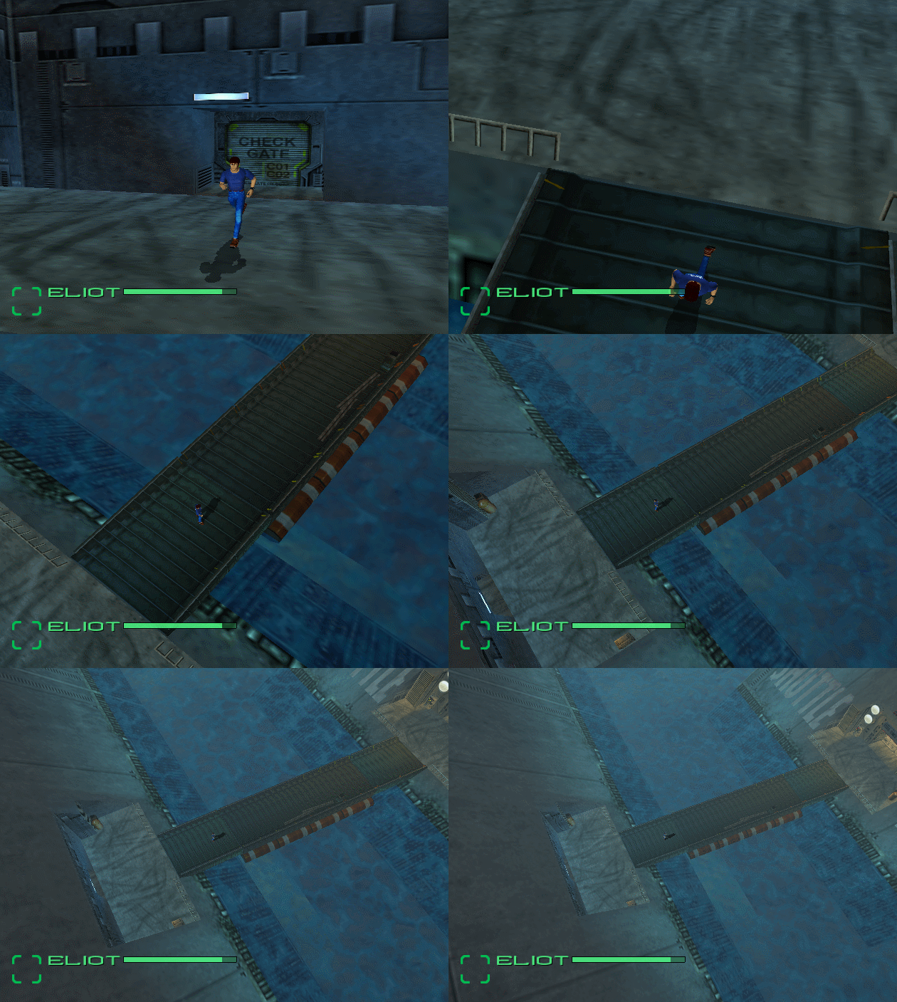
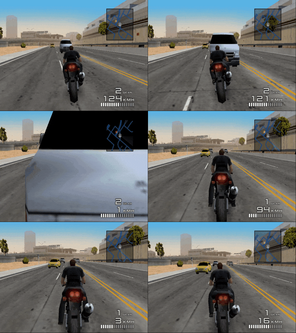
Do you think Sonic Frontiers has lost its Sonic's aesthetics?
Because the graphic's becoming more realistic and enemies are kinda different, not the kind we usually found in Sonic games.
Compared to Lost World, it's very different.

A'ight... prepare for a big'un!
Honestly... it is difficult to "pin" exactly what "Modern Sonic" aesthetic is.
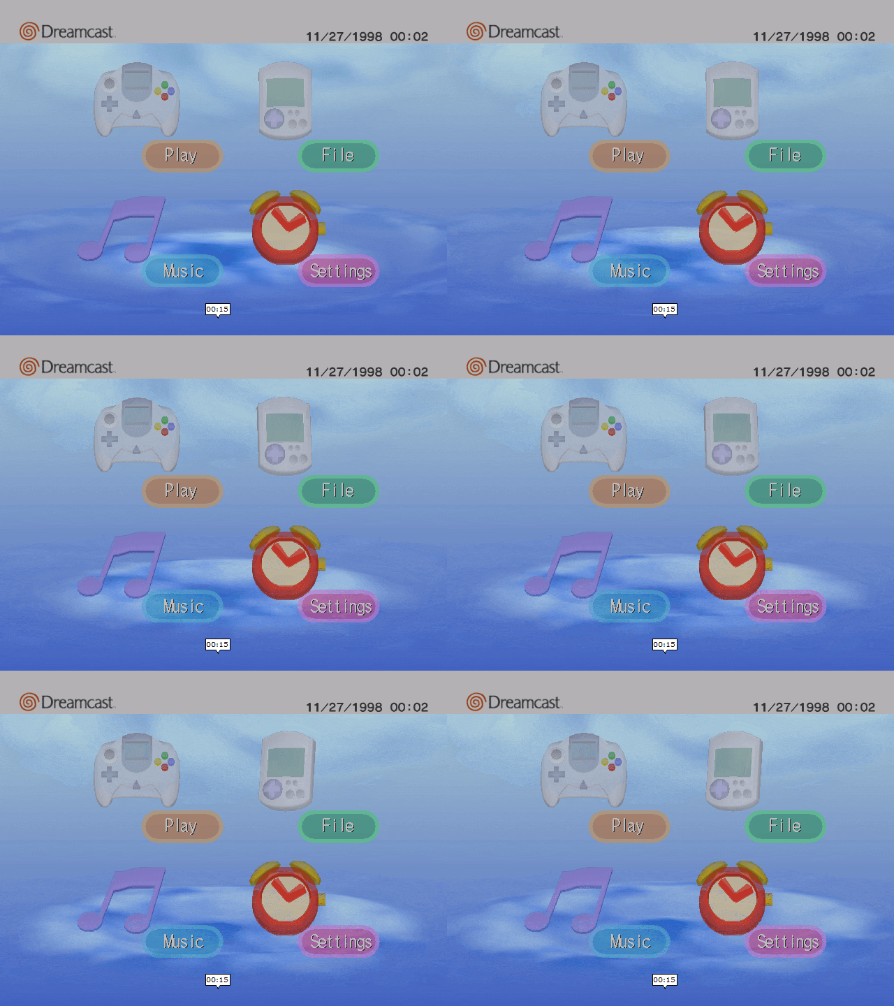
I mean, my guess for Sonic Adventure they tried to go for realistic the best of their capabilities for the Dreamcast but because of the 256x256 and 128x128 texture limit, the console's lighting capabilities and other factors the adventure games still had their limits.
That and some stages in the adventure games forego "realism" for style.

Sonic Adventure was still a rather colourful game, and these themes of "colourful abstract realism" carried on throughout the Dreamcast-era of Sonic.
There was always something about the graphics of the Dreamcast-games that just sort of made Dreamcast games unique. I could never put the words what it is but it's like what would be regarded it's limits for a console for it's time was also what gave it it's own aesthetic.
Then there was Sonic '06 which I can tell tried to be like the Dreamcast-era but also trying to be more realistic.
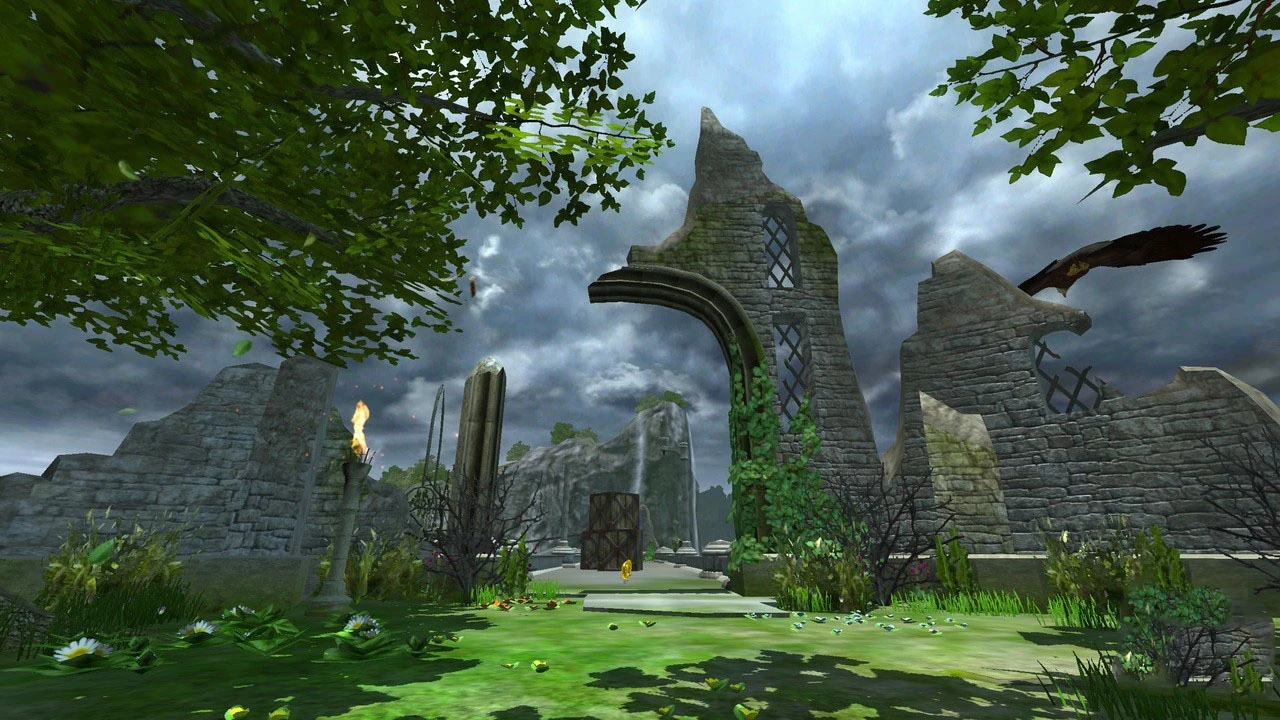
In a way, some of the stages complimented it well such as Kingdom Valley or Tropical Jungle while other stages were rather generic in style.
I think the "definite style" for modern Sonic was finally founded in Sonic Unleashed. They seemed to have found that good balance of colourful, abstraction and realism that really brings out the world of Sonic without losing it's core values it had since the Dreamcast-era.

My only complaint in design were the cartoony humans, which just look odd when they stand against the degree of detail on the Town Stages.

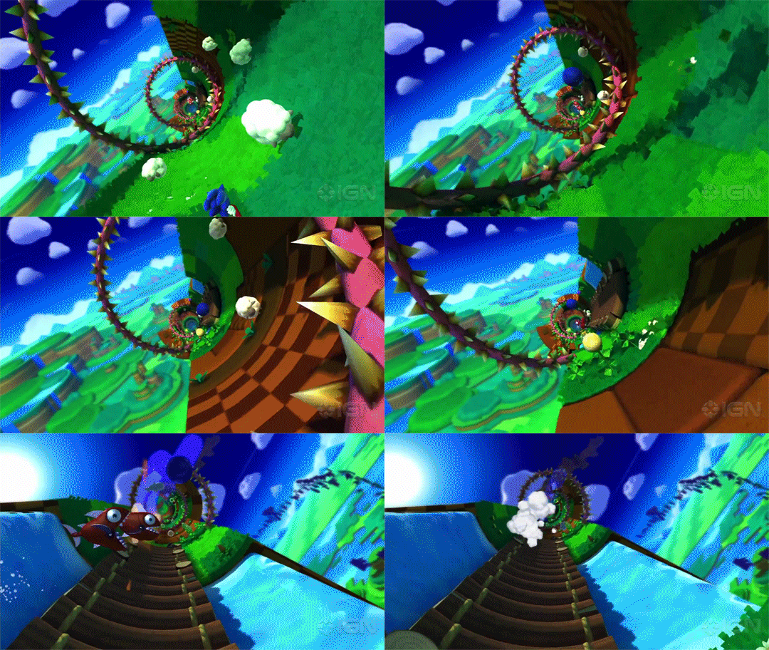
Then by Sonic Colours, they decided to just make it all colourful and cartoony. I figured it would just a one-off thing given it's supposed to be themed on interstellar amusement park and alien planets

It actually got
worse by Sonic Lost World which had this sort of very colourful, yet sort of blocky like geography.

But you know what Sonic Lost World design reminds me of? It reminds me of Master System/Game Gear Sonic games, which had similar graphics design due to the limits the 8-bit consoles had.

So in a way, "Lost World" geography-style could work for Classic Sonic games but only under specific circumstances.
By Sonic Generations they seemed to went by to unleashed style of scenery design where they balanced colourful and realism and this really work! I mean it's kind of the style established since Sonic Adventure but shows it can be applied as a design scheme to older stages as well if done right.

But for some reason, in Sonic Forces, they decided to "mix it up a bit" by mixing in some of the blocky Lost World-like terrain which sort of clashes with the realism a little which made it look a bit "Mushroom Kingdom" in some places.

Do you think Sonic Frontiers has lost its Sonic's aesthetics?
Because the graphic's becoming more realistic and enemies are kinda different, not the kind we usually found in Sonic games.
As for your original question, I don't think they lost the aesthetics established in Dreamcast-era, Unleashed and Generations but given it is now a more open-world game means they can't use the usual level designs we've grown familiar with in Sonic games, thus why these designs are used for platforming segments scattered throughout the islands as well as Cyber Space stages.
But, I think in writing this rather long-winded post of mine, I think I did some up with what could be regarded as a "Sonicore" aesthetic that could be applied to most games.
- Roller coaster terrain, unlike most platforming games (such as Mario games) which usually consist of angular slopes and platforms, Sonic Team design their stages more comparable to roller coasters with loop-de-loops and twists but incorporate them into the terrain and design of the world. Almost all Sonic stages feel like running on a roller coaster track and with Sonic's speed have that feel of exhilaration of speed and loops that most other platforming games don't have.
- Bright and colourful, yet a degree of realism, best exemplified in Dreamcast-era games, Sonic Unleashed and Generations. However, it's OK to lean towards realism and less colour at times as long as it compliments the stage, such as Kingdom Valley from Sonic '06
- Classic games can favour cartoony over realism, Sonic Mania and Superstars aren't exactly "cartoonish" in level designs but still have flora and geography that seem more on the whimsy than real, and that seems fine as it compliments the Classic-era characters well.
I guess my conclusion is that when it comes to "
Mariocore", Mario games have followed a distinct style that they've kept as a constance throughout the series, but they did make some alterations to fit in with a "Classic-era", an "N64-Gamecube era" to a "Modern-era" of their own.
Like Mariocore, "Sonicore" has also adapted its style throughout its era but taken more different changes to exemplify the graphical capabilities of Sonic games as well as to fit in with Sonic's ongoing style. Classic-era being more whimsy and colourful in level design while Dreamcast-era and most Modern-era being just as colourful but favouring realism but can still be applied to zones from the Classic-era such as Green Hill Zone. Sonic Generations best exemplify this.
I guess in a way, I'ms tarting to see what Sonic's aesthetic more is. I just wish "Sonicore" is as recognised as "Mariocore".
As for "Segacore" in general, that's something I yet to identify... but as I mentioned, there was something about Dreamcast games I always thought had their own "vibrancy" to them.
