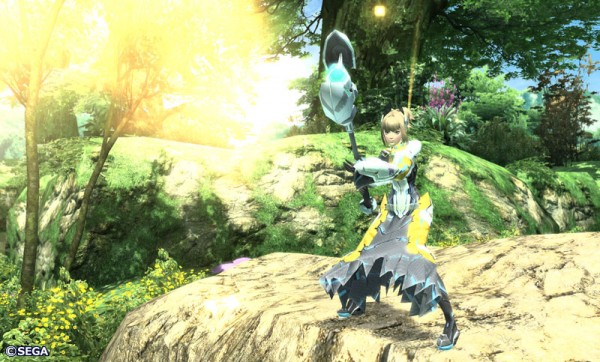
New Phantasy Star Online 2 screens! Now with 100% more cuteness. How can you resist the cuteness of the Rappies? You can’t! These screens also look better than the last batch of PSO2 screens that were released. Continue on to see more screens.

This is our first glimpse of the male force in PSO2. Looking good as he did in Phantasy Star Online!

This is the female force, which we have seen before in other screens.
Which screen is your favorite? I like the rappies.
[ Source: PSUblog ]


This game looks so beautiful!
still need some serious work on Textures also they need to add great Lightning effects.
Don't see how you can praise the crappy graphics of binary domain (Cinematic graphics don't count) and then bash the refreshing visuals of PSO2. PSO2 is looking great in these screens.
I'm not sure to like the character design but the overall looks good for a MMO. I'm more anxious about the soundtrack. Hope it will be as good as the first one.
THIS HAS TO COME TO CONSOLES!!!
Binary Domain might not have the best graphics, but I would not put them as 'shitty'. It has better texture work than this game.
@ ShadiNeko
you are wrong… totally wrong!!
first of all i think you are preferring PSO2 over BD "aesthetically" and eve though i don't agree with you! each of the games are trying to capture something totally different, the creators of BD don't want to go all out crazy with the designs, they want to create a believable settings as much as possible. (they said this many times now)
secondly, in term of tech BD is on par with most of the great looking titles on consoles… great textures , great modeling, huge scale , great lightning/shadowing technology, decent animations and physics, very impressive destructible enemies with super real particles! even special effects like "rain" seems really impressive…. and no there is no any differences at all between the cut-scenes and the in-game footage. this was the case with Yakuza series but not with BD.
I think this looks gorgeous… want to explore.
Visuals REALLY remind me of Star Ocean 4. I like it, though. Visually appealing. The tech may not be the best but the art direction makes up for it, something not the case in Binary Domain, which looks like a gray Yakuza 3 when playing it.
These screens look better than the earlier ones we've seen.
@fluffybunnyboy
you should compare PSO2 with games like monster Hunter not with massive games like wow or guild wars and even though take a look at this http://www.youtube.com/watch?v=FjCehYrEbO0&fe…
this is "technically" tons better than PSO2 or of what we saw of the game so far …
PSO2 is a game that supposed to played for at least 4 years after it's initial release and it's already dated!
as for second part of your talk
i have to disagree, BD is on par with not only 3rd person shooters but with most of the games i saw on (consoles) not PC (so BF3 and crysis 2 "PC vers" don't count)
*yawns*
Binary Domain is going to be competing against the likes of Gears of War 3. LOL. Much as I hate Gears of War I can't deny it's got good graphics, unlike Binary Domain.
Binary Domain is a Japanese gears of war clone. It's going to bomb in the west due to looking like an inferior Gears of War 3. Japan won't care about it, and the game will be forgotten.
PSO2 has amazing art direction and I don't care if it doesn't look as good as some generic western MMO
Its a Gears of War clone? You better stop trolling dude.
Stop copying everything Eastside has been saying on Twitter. Half of the stuff in Binary Domain is not even present in Gears of War (Hello level design) and PSO2 does not have "Amazing" art direction, we've only seen the forest and that looks like any other forest.
The way I see it, a game that doesn't have great graphics technically, if it has a great art style, it can still be a really good looking game. The same can't be said the other way around, doesn't matter how great the graphics are technically, if the art style is bland or ugly, the game won't look as good as a game with lower technical graphics but better art style.
you know what? the game need to look at least like the cut-scene by the end of this video http://www.youtube.com/watch?v=pcE1ZMt-kss&fe…
Look. I'm sorry for dragging Binary Domain into this.
I was just annoyed seeing these screens being bashed when there isn't anything all that bad about them. Yet you guys have no problem praising Binary Domain, which in my opinion, is looking so generic and boring visually. The last batch of PSO2 screens, which weren't even posted on the front page I don't think, were horrible. Those indeed looked horrible. But these screens are quite nice.
Obviously we won't agree on this, so I guess we will have to agree to disagree, huh? =P
Variety is the spice of life.
If you have no idea what Binary Domain is about then it should not be brought up, especially on a site that is loving the title. As Aki said, Phantasy Star Online 2 has only shown forest scenes that really honestly look like any forests.
And the graphics are decent from what I have seen – Though I guess this can depend on how big the levels actually are. I like the art direction too but it is barely different from PSO1. The outfits are fairly generic in a way I was honestly looking forward and not too weird and designed by sexual deviants like a lot of MMOs are lately. Anyone can tell the people in basic robes with the staffs are obviously the magic casters, for example. Binary Domain literally has some of the most unique looking robots I have ever seen anywhere though, so it should not be written off for being a story about people fighting robots. Give it a chance man…
Ehh.. I'm not even going to get into it =P sorry. Read my above post. That's all I've got to say on the matter.
"yes i am dead serious, BD is one of the best looking games on consoles, i can "easily" claim that it looks better than the likes of Dead Space 2 or Mass effect 3. "
Whoa, whoa whoa…..REALLY man? Sorry but that's just not true. The game runs on the Yakuza 3 engine….which was dated when Yakuza 3 came out. I'm sorry but there is no way AT ALL that Binary Domain is the best-looking game this gen. It's not even close. The game's visuals are dated and look like it. Cutscenes look impressive, they always do in Nagoshi's games nowadays. They have great facial expressions. But take it from someone who has seen the game in motion at E3. The visuals are not great. At best, they look decent.
There are some impressive-looking boss designs and cool visual effects but the simple fact is that the dated game engine just sinks the entire game's presentation. It's like watching a movie on a dirty TV screen; there may be some cool things visually going on in the film, but the unclean TV screen just is impossible not to notice.
And before people bring up the whole "Japanese game" thing, Vanquish was comparable to a Western game visually. Resident Evil 5 is comparable to a Western game visually. Shadows of the Damned, Metal Gear Solid 4, Lost Odyssey, etc. are comparable to Western games. Not every game needs to look like Black Ops and lots of Western games don't. If an indie studio like Platinum can make a game as good-looking as Vanquish, there's no reason why Sega's main studio can't.
@ nSega54
"Whoa, whoa whoa…..REALLY man? Sorry but that's just not true."
you know what i am saying the exact same phrase reading your comment!!!
BD IS NOT USING THE YAKUZA3 DATED ENGINE!!! if you can't see this then you have a big problem yourself!!
even Nagoshi himself said in Famitsu that the game is using totally new engine with totally new technologies, and they have yet to name the new engine
and NO the in-game footage in BD is within the same quality of the cut-scenes in the game, there are no differences of any kind AT ALL!!! this is the trick that make some people believe that it's using the same engine used in the entire yakuza series this generation.
you have the same textures quality, animation, lightnings etc in the in-game footage, nothing is lacking in comparison.
and EXCUSE ME!! Shadows of the Damned and Vanquish are comparable to a Western games visually!!!! but Binary Domain is not!!!
what kind of joke is this??
lol dude they look better than Binary Domain. By far. And yeah there's a big difference between the cutscenes and in-game visuals. Just like Yakuza. Trust me.
And where did Nagoshi say it's running on an all-new engine? Do you have an exact link? Because I find that really hard to believe.
"dude they look better than Binary Domain. By far"
lol what! not in a million years, BD engine is superior in every single aspect! if you want to seriously compare do it with proper engines not some mediocre shit engine like the one used in Shadow of the Damned!!!!
and yes there are no differences of any kind between the in-game footage and cut-scenes in BD
you tell me?! what are the differences between
the cut-scene http://cdn0.spong.com/screen-shot/b/i/binarydoma3…
and the in-game footage http://i.imgur.com/NsrWT.jpg http://i.imgur.com/2hUEY.jpg http://i.imgur.com/gyuOg.jpg
also those photos from close range so we can see models details and lightning effects http://i.imgur.com/OjZfN.jpg http://i.imgur.com/rN1E0.jpg
can you tell me what's wrong with those in-game photos compared to the cut-scenes we saw in the game?!!
as for Nagoshi he said this in a Japanese interview with Famitsu http://www.famitsu.com/news/201106/10045044.html
and this quote from gamespot
"The team is also experienced with the high-end machines, and Binary Domain uses a lot of technology like shaders and motion capture that we did not use for other titles."
He says that they're using shaders and motion capture. He doesn't say the game uses a new engine.
Anyway, those gameplay shots indeed do look nice, but the game doesn't look like that in motion. We have seen some gameplay footage in the trailers and it doesn't look that good. And having played it, I can say it doesn't look that good. Now, maybe the game looks better now than it did at E3, who knows. We'll see. So far I haven't been impressed with its visuals.
"do it with proper engines not some mediocre shit engine like the one used in Shadow of the Damned!!!! "
Eh? Shadows of the Damned uses the Unreal Engine 3, which has powered some incredible-looking games like Enslaved, Mirror's Edge, and Mass Effect 2. It's far better than anything Nagoshi's team has come up with this gen.
And everyone who has played it also says the game is great graphically, barring IGN, who seemed to be the only one who disliked the game at the whole of E3. Finally, Yakuza's engine experiences extreme slowdown when too many objects appear on screen, this is not the case for Binary Domain.
"Shadows of the Damned uses the Unreal Engine 3"
Just because a game uses a licensed engine does not mean they will get the full potential out of it, this is the case with Shadows of the Damned.
Furthermore, if you consider Mirror's Edge an "Incredible looking game" but not Binary Domain, than I think you may not understand the technical aspects of engines and are rather influenced by art direction, which is all well and good, but it is not good graphics. Mirror's Edge is quite poorly looking once you decide to zoom into the objects and textures.
I'm baffled by this discussion…
Binary domain got bad visuals? Really?
BD> PSO 2 by far even if I prefer PSO 2's artstyle 🙂
PSO is more impressive because it's a big MMO world versus the linearity of Binary Domain.
I cannot for the life of me work out why we are comparring Binary Domain to Phantasy Star Online 2… They could not be more different.
Frankly I think they both look great, PSO2, Binary Domain, Aliens Colonial Marines and Sonic Generation are the 4 Sega games I'm most excited about.
@nSega54
"He says that they're using shaders and motion capture. He doesn't say the game uses a new engine."
he said "a lot" of new technologies including shaders and motion capture
with famitsu he was talking about new engine
"Eh? Shadows of the Damned uses the Unreal Engine 3, which has powered some incredible-looking games like Enslaved, Mirror's Edge, and Mass Effect 2. It's far better than anything Nagoshi's team has come up with this gen."
so what if it was using UE3 ??? not every game managed to do something great with it, and in this particular case the game is far from showcasing any powerful tech.
I still don't see why we are all still arguing over this. What it comes down to is we all have a different opinion of what looks good and we won't ever agree on this particular subject. Some people would rather have a gray game with higher detail then a fun colorful one with less detail, well, good for them.
Seriously >_> everyone is just repeating themselves now. It's best to just agree to disagree instead of keep arguing.
I brought up Binary Domain because its a freaking double standard. Nothing about that game looks good graphically compared to other big western console games, yet everyone here praises it. But PSO2 doesn't have super detailed graphics and it's liek OMG WHAT A PIECE OF SHIT.
You know. Maybe they had to keep the graphics down for budget reasons. I'd rather them put more of the budget into the game itself rather then the graphics if they were limited on budget.
My point is, these "bad" graphics won't stop the game from being fun if Phantasy Star Portable 2 is anything to go by.
oh, and it looks nothing like PSU. PSU is bland and boring. PSO2 actually looks really fun.
this is what PSU looks like: http://xbox360media.ign.com/xbox360/image/article… now that's a generic forest with low detail PS2 textures.
The textures in PSO2 do have some good depth to them. They don't look like PSU's at all. If you can't see it then maybe you just got a shitty monitor. I know I was on a computer with a shitty monitor not too long ago and it made these screens look bad. None of the detail was showing up.
It's not even just Western games. Binary Domain doesn't even look as good as RE5 and that came out 2 years ago.
"so what if it was using UE3 ??? not every game managed to do something great with it, and in this particular case the game is far from showcasing any powerful tech. "
The game looks pretty damn nice. I never said it was like "the most impressive-looking game this gen" or anything, but it's certainly competitive with your average Western game visually. It's very pretty at times. If the tech's outdated the art direction makes up for it. Binary Domain, on the other hand…
"I brought up Binary Domain because its a freaking double standard. Nothing about that game looks good graphically compared to other big western console games, yet everyone here praises it"
Yes it does, a lot of people keep saying it looks good because actually, it looks good. I realize you are a fan, but the fact is PSO2 does not have really good graphics and Binary Domain is far superior to it. There is no double standards in it, go watch the latest trailer, Binary Domain looks impressive in both ingame and cutscenes.
Eastside may have tried to convience otherwise but the fact we have so many members saying otherwise, in particular some of these members dislike Yakuza's tired rehashed level of graphics, I think proves people are not using double standards. They are impressed by Binary Domain visually and its not hard to see why.
This game is also pretty early in development to my knowledge, I mean, the alpha itself hasn't even started yet has it? Either way I expect that the visuals will get an upgrade as the game goes along. I do agree that they aren't stellar right now (they're not horrible, but they also aren't amazing) but they do look better each time a new screenshot set is released, even if the increase in quality is not a huge leap forward – its still there.
As far as PSO 2 looks, it'd be much more impressive if it were a console game, not a PC game. But these screens are definitely an improvement.
I'm gonna be really surprised if there isn't a console port eventually. PSO is played best with a controller, and unless they've done some dramatic gameplay changes to it that make it better with a mouse everyone will end up hooking up a controller to their PC.
Everything about the game looks like its being built for consoles. PC's are capable of much more, but we will see I guess =P
PSO was ported so many times, I'll be surprised if PSO2 isn't.