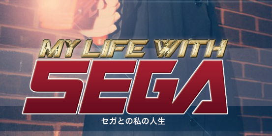
Welcome to the new theme for SEGAbits. I hope you guys all like the changes we made to the blog. Instead of having quotes in the banner, we now have changing pictures. Refresh the page to try that out.
We are always looking into improving the site, so if you have any comments or questions make sure you contact us. You can comment as well and let us know what you think.
Enjoy!
Shadi Edit: We are also working on a mobile version for those of you with smartphones, I’ll be making a post about that once it’s up. Don’t worry, I haven’t forgotten about you smartphone users.


i like this version of segabits and i like the older one to so i like both versions
Pretty slick.
But where are the Streets of Rage enemies in this design?
I really like the new design over the last two. Great work!
You really outdone yourselves guys :).
Blinded by the light~
Looking great! And it goes up on my birthday no less, great way to start the day 🙂
I put the banners together, btw, so if anybody has sweet unique high res SEGA art (not in-game screens, but art or renders) hit me up in the forums and we might be able to use it in the banner rotation.
I snuck in a speed highway banner from generations, that level qualifies as art, IMO.. xP
Lovely!!
Awesome, now all we need is a new sega console and we party it up 😛
Are those high res mega drive era art works in the banner from my Scans by any chance? Looks slick, nice one.
Barry told me he scanned them from magazines, so maybe that’s what he meant
Yeah, I had lifted them from the SEGA Memories article after a failed attempt at scanning them myself. Hope it’s cool 🙂 I’m hoping to scan more myself from the art book, as well as the upcoming History of Sonic book. They’re awesome images!
Of course it’s fine 😛
Looks very nice, but I am noticing issues in Firefox 8.0.1 with the random banner images. It often loads pixel fragments of one banner on top of the other and I can’t see which is the true image until I scroll down, and then scroll back up to reveal it again. Safari and mobile Chrome do fine with it, so yay Mozilla for being a troublemaker.
There is nothing I can do to fix that. Sounds like an issue with FireFox 8. It worked just fine in FireFox 7. Sorry to hear that, though.
The fact that it fixes itself when you scroll back up means it’s definitely an issue with FireFox 8. It sounds like the images are loading just fine.
Oh, btw. Try clearing your cache if you haven’t. That might fix it. Never know!
I love the artwork! The only thing that bugs me is the same as last time… that’s not the actual SEGA logo. The font is slightly different, especially the S and the A. But nevertheless the design looks great. Thanks for all your hard work!
Yeah, it keeps us from being sued! /lame joke.
But yeah.. the logo has always been made from a SEGA font, ever since George made it, and that’s just what we have stuck with, the SEGA font isn’t fully accurate to the SEGA logo I’ve noticed.
I’ve noticed the same thing, but I learned to let it stop bothering me.
The site’s looking pretty fantastic. Very well done :).