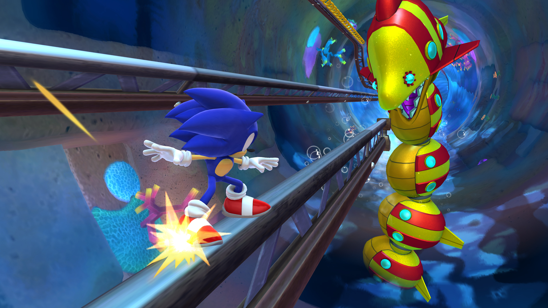
Seems that Gametrailers got access to a direct feed gameplay session with your boys over at SEGA and in the start of the footage they included the opening cutscene from the game.
So what stage are they demoing? Windy Hill Zone 3, in case you wanted to see the whole video.


Looks good! I love how HD and pretty it looks, and I like how Sonics design is somewhere in the middle of Modern and classic sonic. I kinda get the impression that this game follows the original games chronologically quite soon after they end. Maybe after Sonic 4 or something.
I still think Sonic should maybe get rid of these kind of cut scenes. They come over as… really forced feeling and badly scripted.
The game itself looks top though.
Not a huge fan of how on-rails the game looks…
The segmented design really doesn’t seem like a good idea, considering how painfully short the segments are, barely run for 20 seconds before you get launched into a different.
Plus it really looks as though you’re running more through a tight as heck corridor than
a proper Sonic level, there are branching paths and shit but it doesn’t really give you the impression of freedom.
And the design looks repetitive as fuck. Not impressed.
*braces for hate*
That seems a little unfair given that the level is built around a tunnel motif. Plus there are branching paths. You smash through the floor to get to them.
Honestly, I agree with the claustrophobic aspect, all the levels shown, except the 2D plaftormer-styled ones, feel more like you’re running through a tunnel rather than an open area. Every game since Sonic Adventure gave you the feeling of running through an open area even though you were restrained by invisible walls/death zones/bottomless pits everywhere. It’s not just about this particular level.
Also, all the gameplay footage shows that the game lacks any sort of flow. You always see the player stopping after some section to readjust, new homing attack is as undynamic as it gets, and most sections are completely automated/scripted (springs leading you somewhere, series of boost pads, compulsory wallrun section (seen here)).
Game encourages you to take it slow, but there’s really no benefit of taking it slow because there’s no exploration aspect within any of the levels they’ve showcased so far because they just set you on a straight, nearly obstacle-less path from point A to point B with a branch or two along the way leading to another uninteresting straight path.
Those branching paths really don’t seem like a whole lot, if you watch footage from, I dunno, Generations, modern levels, you’ll see that you reach branched paths >dynamically<, you run, take a turn or jump, or stomp the floor, no need to stop to aim for a particular spot. From the looks of it, all you get here from taking an alternate route is … well, more of the same. It's not a cool new route kind of deal like in most previous Sonic games, where you'd get to see some unique models or some hidden location and whatnot, you just get an alternate route that looks the same as the rest of the level, a.k.a. repeated assets from start to finish.
How many times within the level did Sonic break floor to reach a branch? Two? Three? And every single time there was a bunch of 10-ring rings below. There were at least two identical rooms with the flower things from which Sonic got rings. Design of this level (and others showcased in other videos, such as the forest level, where Sonic runs through the same tunnel and goes through the same honeycomb at least twice) is just plain repetitive – you didn't get this sort of glaring repetition problem with other Sonic games.
Well, this is just my impression. Sorry about the wall of text.
PS He said there ARE branching paths, so pls be more careful when reading.
You have no idea what you’re talking about. The gameplay seems to have plenty of flow; way more than the unleashed styled games. And there are plenty of rewarding alternative paths to explore that offer definite benefits be it red rings or extra animal capsules. Stop trying to hate things just to hate them. This is the closest we’ve gotten to a 3d Sonic&knuckles since SA1.
“Mommy, this person dislikes something I like”
Sorry, Rappy, but “you’re a hater and you have no idea what you’re talking about” isn’t really a good rebuttal.
Neither is nitpicking.
You ignored each and every point I brought up. You ignored all of it and your screenshots prove it, here’s why:
The 1st screenshot clearly shows there are paths you must walk, you most likely can’t hop over the pit, which contributes to claustrophobic/tunnel feeling of having to walk near-empty corridors. Plus, repeated assets, which I also talked about, and boring design (flat land, some palm trees, no backdrop whatsoever, just flat blue sky)
Also, the screenshot with the rocket wisp just helps reinforce my argument about how scripted and automated the game is. Thanks.
How does the rocket wisp prove how automated the game is? You point and aim using the wii pad to shoot it. If anything, you’ve never had more options as to when you want to use it and how. Why am I even wasting my time replying to you?
Do you know what claustrophobic even means?
In that first screenshot, you really think the whole thing is going one path or you can’t jump over that small pit to the platform (left of the screen) with the motobugs? What sense does that make, huh?
In the second screenshot, I’m pretty sure it was not the rocket wisp but map below that Rappy was trying to show you to give the full scope of the stage. And anyway the rocket wisp is just a gloried version of the Sonic Adventure rocket that would usually help you advance or take one of the many rare shortcuts that were available. Your argument on it’s “automation” and “scriptedness” is irrelevant. The hell else would it do?
what is exactly claustrophobic about these?
http://www.sega-press.com/Sega/Screenshots/28524TropicalCoast_Zone2_130830_03.jpg
http://www.sega-press.com/Sega/Screenshots/28525TropicalCoast_Zone2_130830_10.jpg
These seem to do as good a job as SA1 in terms of giving you an open area to explore. Way more so than the unleashed trilogy I might add.
What the hell does it matter to have “open” looking areas even though you can’t reach them? Is there any relevance in saying that?
Lost World has a lot more depth than most previous 3D Sonic games thus far just for the fact it has layers.
I just got a Wii U, and I really hope I can find some cash to throw towards this game. I wish SEGA had more to offer this year, but at least I can finally give Sonic some attention with no internal competition.