Play Asia has posted the entire exhaustive interview Famitsu ran with some of Persona 5’s art and audio leads.
First up is Art Director Sudou Masayoshi. He discusses the usage of color for the last few Persona games, the wild UI that Persona 5 boasts, his sources of inspiration, and more.
From the first full Persona 5 trailer we saw a lot of the Game User Interface (GUI) that you created for the game, it really is a splendid piece of work. Your chance to create such work began with Persona 3, correct?
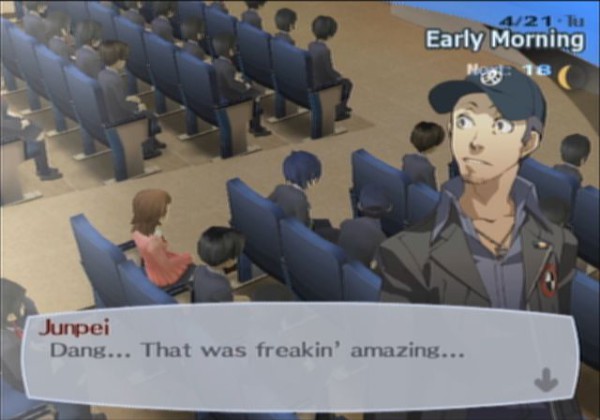
Sudou: Yes, whilst working on Persona 3, Mr. Soejima (the games character designer; Soejima Shigenori ) we got together a lot to throw ideas and see if we could confirm how to create the games GUI. Not just the GUI but also the game’s website design. Speaking of design, we really wanted to create a GUI that didn’t just stand out in a game related magazine but also something that would look interesting and stand out in magazines aimed primarily at females as well, it was an idea that I never thought of before. I always like using traditional methods, I tend to not add gradations, but prefer filling in each and every graphic. When I’m designing, I will continue to create my best work through trial and error until I feel 100% satisfied.
Is there something that you’ve put your entire heart and soul into when it comes to your designs?
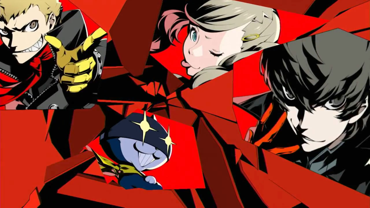
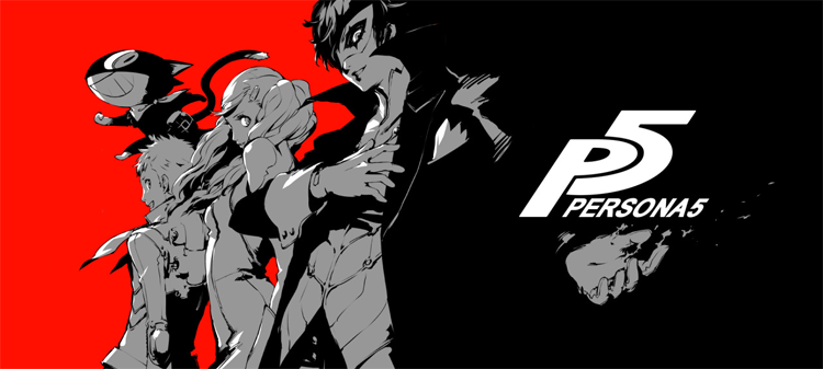
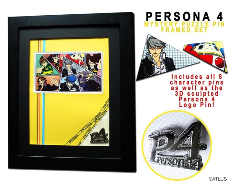
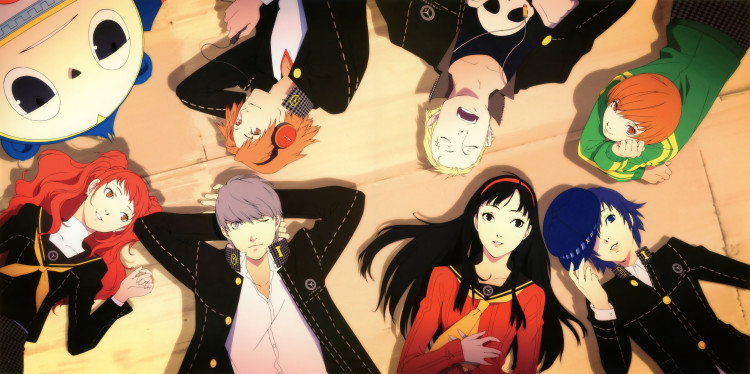
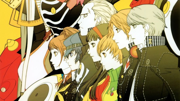
Sudou: The biggest thing I put my all into was regarding the color of the interface compared to the game’s main color scheme. For example, the main color for Persona 3 was teal, Persona 4’s a vivid yellow color and so I had to decide the right colors for the menus etc. Of course Persona 5’s main color scheme is a crimson red and therefore after much deliberation I sat down and after trying out black and white text I was confident with it.
Lead Sound Designer Tsuchiya Kenichi and Sound Composer Mr Meguro Shouji are also featured. You can read the entire piece here.


