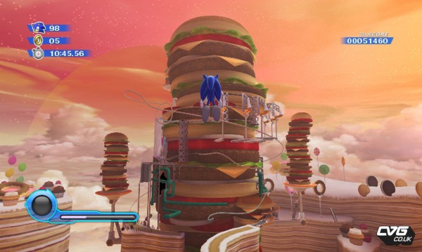
Here are some Sonic Colors screens, same one as the ones in the Nintendo Power scans, only directly from the game. Obviously I got the screens from CVG, since they put their nice watermark all over the press screens. Thanks.
They also have the first preview for the game right here, if you are interested in that.
Ad:


Those screens do look pretty nice.
Is it wrong that I find this game more interesting than Sonic 4 now?
I can smell the writer of that 1up previews WANT to pan Sonic Colours already.
New Trailer mortals New Sonic Colors E3 Trailer with theme song http://www.youtube.com/watch?v=o7bt49zGN8g&pl…
McDonalds.
Burger towers? Cake mountains? Bacon bridges? GOD DAMMIT IIZUKA!
That food stage looks amazing. I don't think I've seen such a unique stage since Sonic Advance 2's Music Plant.
Vegetarians are not gonna like that level.
@matty I'm going to have to side with you. I've gotten a lot more interested in Colors than Sonic 4.
I was privileged to an advance preview. In the burger levels Eagles appearing flying mid-stage and land on the tasty burgers eating the sesame seeds from their buns.