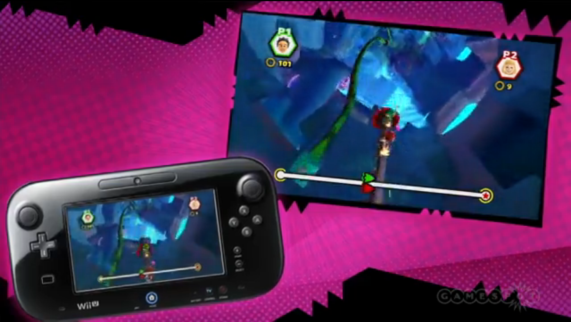
Above is IGN’s video where they … get this, talk positive about a Sonic game! I know, I couldn’t believe it. Though, if you are tired of this game being compared to Mario Galaxy….it is weird that right after the guy says that Sonic is going back to his roots with stages, colors and etc, but is still Mario Galaxy looking? Riiiiight…
I also like how they pretend the 3DS version doesn’t exist.


Is the narrator a boy or a girl?
Um… did they show Sonic 4 Episode 2 using a fan mod?
Yup, Dario FF’s Classic Sonic mod to be precise. They actually took it from a trailer he put up earlier today, and it’s the first Sonic 4 episode 2 video on Youtube that pops up when you search for the game at the moment. So that’d explain why they showed the mod. :V
looked really neat wow. Modern looks so dumb compared
HER name is Keza McDonald. I hope she doesn’t see this page for her own good.
IGN reviewed the previous 2 Sonic games positively, so I’m not sure where the hate’s coming from, lol….
What hate…. in regards with perception?
“What hate…. in regards with perception?”
With regard to George’s tone and comments on the gender of the narrator.
People hate IGN, can’t spell IGNORANT without Ign :P.
lol I thought it was a boy. it’s a…trap!
also I think this talk about the look of the game harkening back to the old games pretty much clueless.
were the MD games simplistic looking? nope
this game is garbage, I disagree with all 5 reasons.
1-Going back to its roots = Mario Galaxy roots?
2-its single platform = well, since it’s bad It’s good that is wiiu exclusive, lol.
3-Awesome level design = lol, please…
4-Control are great = the first sonic that have a run button…but I’ll wait to judge this.
5-it looks gorgeous = NO, it looks like garbage.
No you don’t, you only disagree with three of them. :V
“also I think this talk about the look of the game harkening back to the old games pretty much clueless.”
Didn’t Iizuka himself say that the look was intended to be harkening back to the old days? I could be wrong though, but I thought I remembered him saying that?
Certainly it looks closer to those games in style than the more realistic, real world-based art style featured in Unleashed and Generations.
“1-Going back to its roots = Mario Galaxy roots?”
Going back to its roots as in an increased emphasis on platforming instead of the racing game-styled boosting gameplay of Unleashed and Generations. (And Colors, to a lesser extent.)
“3-Awesome level design = lol, please…”
Level design seems good to me, lol. What’s wrong with it?
“but I’ll wait to judge this.”
Probably not a bad idea.
“5-it looks gorgeous = NO, it looks like garbage.”
It has a clean look and supposedly will run at 60 frames per second. While I’m not a huge fan of the art style either, saying that it looks like “garbage” is a bit of a stretch, I feel.