
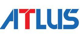
One of the things many Atlus fans feared during the SEGA-Sammy buyout, was that SEGA would kill off the Atlus name and rebrand their titles under the SEGA logo. Seems that is not what will be happening, now Atlus is its own company, separate from Index Corps. To celebrate, we have a new logo (above). Forgot what the old logo looked like? Here it is.
Here is the new Atlus website and here is the new Index Holdings (who also got a new logo).
So, new logo or old? Tell us in the comments!


OH MY GOD, THE CHANGE IS TOO MUCH
Yeah, not a major change but I think it’s a step backwards. Now only the “A” is unique and the rest look like the font “Folio SB Bold Condensed”. They stripped the T, U and S of their uniqueness.
It looks like a logo used for a detergent brand. Buy an Atlus game and get a sample box of dish soap!
They should have hired Barry to remake the logo.
older one was better
Yes agree, the older one was more characterized.