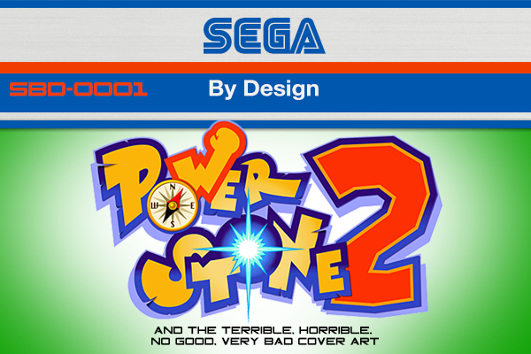
SEGA by Design: Power Stone 2 and the Terrible, Horrible, No Good, Very Bad Cover Art
Welcome to a new SEGAbits feature: SEGA by Design. Believe it or not, SEGAbits is not my day job. When I’m not working on the site, I’m a full time graphic designer. Before I decided to make graphic design my profession, I grew up wanting to be either an animator or a cartoonist. My childhood influences included 90’s cartoons and video game cover art, and while I loved such works as the covers of the classic Sonic the Hedgehog games, I found myself even more attracted to the package designs that encapsulated the artwork. At the time, I had no idea what this sort of thing was called, I just knew that it was slick, uniform, and involved colors, shapes, and fonts. It wasn’t until the Playstation game Wipeout that I learned of what graphic design actually entailed through the work of The Designer’s Republic. From there on out, I knew I wanted to be a graphic designer and four years of college and seven years of professional experience later, here I am about to tear into the cover art of one of my most favorite SEGA Dreamcast games: Capcom’s Power Stone 2.

