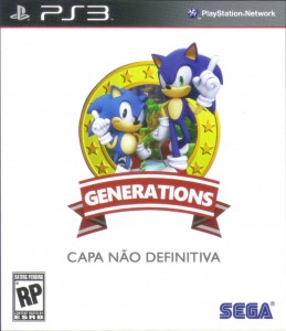
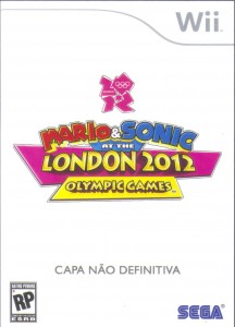
From this TSSZ rumor article comes what looks like non-final boxart for Sonic Generations and Mario and Sonic at the London 2012 Olympics. While these images could still be shopped, they look like the real deal to me.
If true, this would confirm the new Sonic game from the trailer as Sonic Generations and a new Mario and Sonic title. with more Sonic announcements in the upcoming weeks, we should get more info soon.


The generations art looks pretty sweet. But the Mario and Sonic art looks way too easy to photoshop
I think those are real but still WIP.
Anyway, the classic sonic looks like shit on the box art.
They made him look like the USbox art, which looks so damn crap. The trailer was so damn perfect. The hell were they thinking :S
On second thought, it's pretty iconic I guess
http://i23.photobucket.com/albums/b353/sonicandta…
So that is what the difference that people complained, that the spikes on retro sonic are more sleeked back. Not that big of a deal, I actually think it looks better that way.
He looks different than in the teaser. I think they just did it for the box art to make it look more similar to the US box art.
Look like legit WIP shots to me. It's pretty hard to fake a rendered character. Generations is GO!
The only thing is, the "Sonic Generations" trailer led us to believe the game would be on the PSN and Xbox Live (both logos were shown at the end of the trailer); this could indicate that the game is download only or that it makes use of online play. If it's the former, then boxart wouldn't be necessary.
Both boxarts are a bit too simplified for what Sega normally does. I think both–especially the Olympic Games one (the logo is just a slight variant of the previous two titles) could easily be doctored.
Its not final, seems to be a place holder logo thing.
@Essay: Not true at all.
Watch the trailer again. The logo is the XBOX Live logo, NOT the XBOX Live Arcade logo. XBOX Live and PSN logos imply that the game will have online content, meaning leaderboards and possibly multiplayer. Sonic & SEGA All-Stars Racing had the exact same logos.
This will be a disc release, no question.
I knew it, Sega will be milking Sonic again this year, in less than 3 months Sega will announce another Sonic game.
Dude, it's the 20th anniversary. What did you expect? We knew 2011 would have Sonic games back in 2010.
The Mario and Sonic boxart is a placeholder, they always pack those boxarts with detail, they'd never just have a logo.
Sonic Generations, who knows. I'm also thinking it's a placeholder. Doesn't look particularly exciting.
Placeholder, and I'm certain they're dropping a "SONIC" above Generations. Also, I think it would be quite cool if they emulated the Genesis/Mega Drive box designs. That, or use metallic foil like they did with Colors for the cover. I really want a shiny gold cover for some reason.
These are most likely early concepts. Even so, I really like the Sonic Generations box art.
This is probably true. SEGA still has the Olympic license and the Generations logo looks too good to be fake. I just hope M&S at the London 2012 Olympic Games uses Wii Motion Plus.
CAPA NAO DEFINITIVA means NOT THE FINAL COVER
@ Barry: What I meant was poor Sonic games.
The Mario & Sonic series are purely cash in and especially in the current year, Wii as a hole is a poor platform for game development.