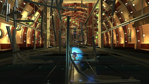
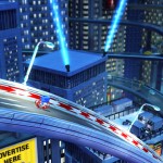
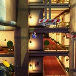
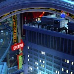
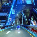
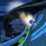
Take a gander at these high-speed Sonic Generations screenshots featuring ‘Speedy Highway’ (first seen in Sonic Adventure) now in glorious HD!
I remember playing Sonic Adventure when it first released on Dreamcast and that one particular set piece in Seedy Highway where Sonic Runs down the side of a sky scraper blew my mind. I’d never seen anything so mind bending, graphically stunning (for its time) and fast in a videogame before. It will stay with me for ever; I hope Sonic Generations can recapture the magic of Speedy Highway!



I agree ManCheese!
Yeah.. different IP’s but same email. so it’s you and you on a IP masking site? XD
Hot damn, my reaction to seeing that stage the first time on DC is equal to my reaction seeing it now. That’s a very good thing.
The graphics engine is stronger, but the art design is duller, as expected. This stage had a lot stronger variety of colors in SA1; now it’s oversaturated with blue.
Also, the signs are in English when they should be in Japanese.
It’s oversatured with blue because that’s the dominant light source at night, and the lightmaps are adding it. It does seem a bit exaggerated though.
Dreamcast had basic vertex lighting, so it was up to the repeated textures to define the color palette.
Yes, but it’s still disappointing even knowing that. The city’s visuals end up being very bland and uninteresting to look at. I do like the “running down the side of the building” screen at the top for some reason, though.
I suppose I should just be glad that it isn’t *quite* as unfaithful to the original game as what they’ve done to the classic era stages. x__x Ugh.