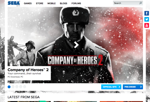
SEGA.com has undergone a much needed redesign! Dubbed “SEGA beta”, the site has been greatly simplified and broken into an easy to navigate grid. The search function has been much improved, with screens and videos given more prominence, as well as handy links to buy the games themselves and links to dedicated microsites. Interesting to note, at the bottom of the site is a breakdown of “Games”, “Brands”, “SEGA Store”, and “Company”. Beneath “Brands” is Sonic the Hedgehog, Total War and Aliens – three major SEGA West franchises. A visit to the European site adds Football Manager to the list. The Store, Blogs, and Forums retain their old designs for now.


No PSO2 in the upcoming games section 🙁
Add more brands to the site like SOJ does and we’ll be set.
I agree, though I see why they only list what they list, since Sonic, Aliens, Total War and Football Manager are the only SEGA West brands. I’m sure a few years back we’d see Marvel on that list (shudder).
Yakuza and House of the Dead would be suitable active brands for sure.
I’m personally not a fan of the design, but I guess that’s more my personal taste. I feel like it could be more interesting, it’s just white squares, looks like a default wordpress theme, and the mobile site is really glitchy and lags my phone.
Also, PSO2 isn’t on the site at all, I just tried looking through all the PC games. I’m pretty sure PSO2 was listed on the old site.
I suppose it could be worse, so I guess it’s good, but it’s not amazing or anything. It does seem to be an improvement over the older site though.
Responsive layout, that’s definitely an improvement. and the Favicon is much better too. Used to be the SEGA logo really small and could hardly see it.
Going back to my white squares comment, i guess it’s fine. Lots of business sites are really simple like that now, so I guess it’s a good design in that sense.
now I’m just rambling on, so i’ll stop
I actually really like it
This is far better than it’s previous one, looks as if there’s more to it, and more straight forward now.
It certainly was ‘much needed’, they had the other one the same way for over 5 years.
It looks “modern” in the most stereotypical sense.
It’s sort of what I think of Microsoft’s new logo. Looking at it just screams “trying to be modern.”
Not saying it’s a bad thing, but generally speaking I’m not a big fan of the whole “modern” look. No idea why it’s taken off; I’ve always hated Apple, and I know a lot of this was their influence.
Anyway. Glad they re-designed it, has to happen from time to time to keep things fresh.
sorry if i sounded harsh in my earlier comment, I guess I was expecting more.
It’s still a good change compared to what they had. it just seems a bit plain to me.
It’s pretty boring, and minimalistic. White blocks, too much rigidity. I’ll take your guys’ word for it that the previous Sega website was worse, as I never visited.
That brand section is very unfortunate.