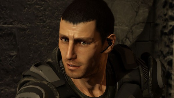
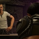
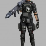
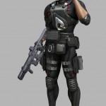
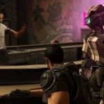
Most people seem to have a negative opinion of Binary Domain’s graphics, but to be honest, they aren’t bad. People have been saying it looks like Yakuza 3, so it’s bad. First of all Yakuza 3 does not have bad graphics and this title looks better than the Yakuza titles.
One of the first obvious improvements is the sharpness of the picture, Yakuza 3 (and 4) weren’t so sharp. Not only that, the textures look way better. If the areas are as big as those in the Yakuza games, this could be Nagoshi’s best looking title.
That is not saying that the title will be one of the best looking titles for 2012.
[Source: AndriaSang]







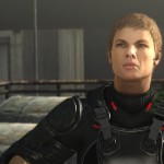
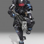
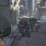

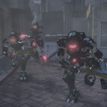




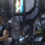
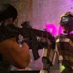


Dude! come on.
The graphics are above average for sure but in this day and age we wanted something to push the envelope and well this is a pretty envelope.
I really don’t understand why people are complaining about the visuals. They look absolutely fine to me. As long as the visuals don’t look like something from a PS2, Gamecube etc. there is really nothing to complain about in my opinion.
I think the people look great, but the environments look bland and not much better than student work. The main problem I have is not seeing an interesting aesthetic.
It’s certainly not “THE WORST-LOOKING GAME EVER,” but nobody was saying it was! But honestly, man, I don’t see why you guys are so willing to settle for less. Am I the only one who expected a new game from one of Sega’s top-tier studios to push the envelope visually? When Capcom puts out a new Next Gen Epic, it looks great. Why not Sega?
The game looks decent. George, it looking better than Yakuza 3 isn’t even an accomplishment because Yakuza 3 was an open-world game and this is a comparatively linear action game….which makes these graphics even more disappointing. I agree about the environments, they’re the biggest problem. Yakuza 3/4 featured noticeably dated tech but they made up for this by loading the environments with a huge amount of detail. Binary Domain looks to me like Yakuza 3/4 but without all that fantastic detail.
It may be the game’s production design that is putting so many people off. The art, save for the enemies, looks incredibly generic. The graphics themselves look okay but it could have definitely used a unique point of view visually. As it stands, it appears to be competing for the same aesthetic territory as Gears of War, Halo, and even vanquish. The first two it will never stand a chance to, and the latter had at least a magnificent sense of style.
WTF are you on about NSEGA? This game has some eh textures, but not nearly as bad as games like FFXIII.Yakuza 3 had some of the worse textures… this game looks way better.
Boggles me mind.. seriously.
lol Binary Domain couldn’t look as good as FF13 in its wildest dreams….
Anyway. Vanquish is an example of a Japanese game that could compete visually with Western games. Binary Domain is not. And the funny thing is that Binary Domain comes from a major studio whereas Vanquish was an indie title.
It looks pretty much comparable to Mass Effect 2; that is, really nice. I think most peoples’ gripes about graphics these days pertain more to art direction than any technical limitations.
NSega, time to take a big load of George is Awesome because you in my wet dream.
Seriously, look at the game screens, look at the textures and look at this:
http://game.watch.impress.co.jp/img/gmw/docs/329/880/ffxiii27.jpg
Super flat ground textures, lighting is meh. I mean, really? Plus all the characters are rather low polygon.
Then this:
http://game.watch.impress.co.jp/img/gmw/docs/329/880/ffxiii33.jpg
Nice PSone game city you got going on there. Binary Domain at least has destructible environment and is real time. Unlike FFXIII.
Also:
http://www.destructoid.com/final-fantasy-xiii-graphics-exactly-the-same-as-tomb-raider-129492.phtml
You might like FXIII for its artistic presentation, but technically its no masterpiece.
I’m with centrale. The game does indeed look gorgeous. Those who don’t like the artstyle shouldn’t go and conclude that the game doesn’t look good from a technical point, because it does.
I’d say Yakuza 5 would benefit alot from these advancements.
In a shooter what I care most about is that the weapons have impact, I hate games where I feel like I’m shooting a pea shooter.
Thankfully largely due to the really awesome damage models of the enemies the weapons pack a serious punch.I love seeing the bits and peices ping off of the enemies.
Graphicly the game is fine imo, not the best or worst.
[quote=”nSega”]Am I the only one who expected a new game from one of Sega’s top-tier studios to push the envelope visually? When Capcom puts out a new Next Gen Epic, it looks great. Why not Sega? [/quote]
Truer words never spoken and really sums up everything.
And I have no idea what is wrong with George for comparing a 2012 game with a 2009 game, offcourse it is better than it but we wanted it to be better than 2012 games and they are several current games that look better than it.
“I’d say Yakuza 5 would benefit alot from these advancements.”
indeed, this is what i am hoping for.
“Am I the only one who expected a new game from one of Sega’s top-tier studios to push the envelope visually? When Capcom puts out a new Next Gen Epic, it looks great. Why not Sega?”
well Binary Domain is on par with what Capcom did this generation and i can even say the game is looking more impressive than their upcoming MT Framework v2 based game “Dragon’s Dogma”
“And I have no idea what is wrong with George for comparing a 2012 game with a 2009 game, offcourse it is better than it but we wanted it to be better than 2012 games and they are several current games that look better than it.”
and why would anyone claim that this 2012 AAA game is looking any better
http://image.gamespotcdn.net/gamespot/images/2011/156/995452_20110607_screen001.jpg
http://image.gamespotcdn.net/gamespot/images/2011/156/995452_20110607_screen002.jpg
http://image.gamespotcdn.net/gamespot/images/2011/156/995452_20110607_screen009.jpg
??
not to mention the game is inferior in term of lightening, special effects and physic (since Binary Domain has some very unique damage system with amazing weapons impact)
Compared to other third person shooters, Binary Domain is above average graphically. Only stuff like Gears of War 3 and Uncharted 3 are really that much better, and those are some of the highest budget games coming out.
I think most people are confusing their preferred style of art direction over actual technical qualities. Although the game is level based, the map design is very vertical, meaning it may be possible to climb all the way up to the top of those buildings. The AI is also incredibly advanced, taking up way more data than something like Lost Planet 2 ever would.
It is just too early to really call the game out for one thing or another. Just wait till at least TGS, I am expecting big things.
the official site updated with new characters and photos
http://binarydomaingame.jp/top.html
one of the characters seems like a Yakuza boss
@ George…. haha first of all, FF13 is a 40 hour game. Second of all, FF13 was that team’s first next gen effort, something that can’t be claimed with Amusement Vision. Third of all, the first pic you posted is a WORLD MAP. Open world. Something Binary Domain won’t be, and fourth of all, ….it still looks better than Binary Domain, lmao. BD has instances of even more noticeable bad texturework than the occasional rocks in FF13, you can see it in the pics!
As far as characters in FF13 being low polygon, wow, no. In-game character models look nearly on par with CG character models from last gen. And yes, FF13 was a 2009 game.
@Cube He’s comparing them because he knows I like FF13. :p You don’t even need to look at FF13, you can look at Resident Evil 5 and see that Binary Domain’s not even close to being on the same level.
My point is that there was once a time when Sega was one of the industry leaders in graphics. Clearly that time has passed.
@-nSega54-
haha now FFXIII is considered better than BD visually??? really?
and what if it was +40hrs??? you can finish this linear game way faster! do we even know how long it will take to finish BD??
and yeah …. lovely “empty” open world! yeah awesome! (and no it’s not world map!)
“As far as characters in FF13 being low polygon, wow, no. In-game character models look nearly on par with CG character models from last gen. And yes, FF13 was a 2009 game.”
i agree it’s great! so does in BD.
and i came with an example of one of the high profile games coming in 2012 and yet BD is looking better than that particular game IMO.
“@Cube He’s comparing them because he knows I like FF13. :p You don’t even need to look at FF13, you can look at Resident Evil 5 and see that Binary Domain’s not even close to being on the same level.”
actually RE5 engine works tons better than FFXIII engine.
and yes BD is pretty much on par.
nice little comparison
http://images.gamersyde.com/image_binary_domain-15492-2173_0001.jpg
http://images.bit-tech.net/content_images/2009/03/resident-evil-5-review/b04.jpg
Dude, no.
Also we are judging too early. How much destruction/size of levels/AI/Effects also have an impact on how graphics will end up looking. Regardless of all that, this game is clear step ahead of the Yakuza engine. Sharper looking, better textures and destructible environments.
I just don’t see it, man. Guess we won’t agree.
Agree to disagree.
It simply isn’t pushing the envelope.
360 games have in the past and will continue to look better than Binary Domain. The game just simply doesn’t look very remarkable visually, I’d say it looks pretty average. And like I said, I expect better from one of a large video game publisher’s main internal studios.
lol the last Final Fantasy game came out nearly 2 years ago and no, this doesn’t look better than it. :]
Suzuki Yu: You’re comparing a cutscene (BD) to in-game footage. BD has impressive cutscenes, nobody’s argued that.
“i agree it’s great! so does in BD.”
Not in-game! In-game the characters look pretty bleh in BD.
“and yeah …. lovely “empty” open world! yeah awesome! (and no it’s not world map!)”
It’s bigger than any single environment in BD will be. Gran Pulse was gigantic.
“Suzuki Yu: You’re comparing a cutscene (BD) to in-game footage. BD has impressive cutscenes, nobody’s argued that.”
“Not in-game! In-game the characters look pretty bleh in BD.”
you know what is funny about this? i can’t see the differences between the cut-scene and the in-game play footage you are talking about!
it’s all the same, same quality and details.
“It’s bigger than any single environment in BD will be. Gran Pulse was gigantic.”
it’s big but empty why would i need such environment in BD? BD has many different ground and underground areas including the entire upper city….. the scale is big, when you look up from the ground city you can see all those towers and bridges and the sunlight coming through all this … incredible scenes.
and here we are talking about one single area “Shibuya”
My point is that when designing a linear game (such as an action game, and yes, Binary Domain is one of them) you deal with much smaller and more scripted environments, which makes it easier to load them with detail, since there’s less to design. Comparing Binary Domain’s tiny alleyways to the gigantic field of Gran Pulse from FF13 is unfair because you’re comparing a GIANT free-roaming area to a linear corridor. Some textures on Gran Pulse aren’t up to snuff, but again, you’re talking about a massive area.
Anyway, that was off-topic. George just used FF13 to get a reaction out of me and it worked.
Regarding Binary Domain, sorry man but the gameplay doesn’t look visually up to par with other games being released today. And having played the game at E3, I can tell you that, (at least, in that build) there was a huge difference graphically between the in-game visuals and those pretty cutscenes.
Had Binary Domain been released 2 years ago I would have felt differently, but the game simply doesn’t look great. I’m sure most critics will award it 7.0s for its visuals, which is, again, not terrible, but not what I’d expect from a studio of Amusement Vision’s calibre.
The game looks better than Final Fantasy XIII and another thing, Final Fantasy hardly has as much detailed compared to those “Tiny alleyways” if anything, Binary Domain puts a whole lot more attention to detail that FFXIII ever does.
The fact that Cube is talking about graphics when he said one of the best looking Playstation 2 games was very average graphically tells the whole story, I think both of you do not actually realize what graphics means.