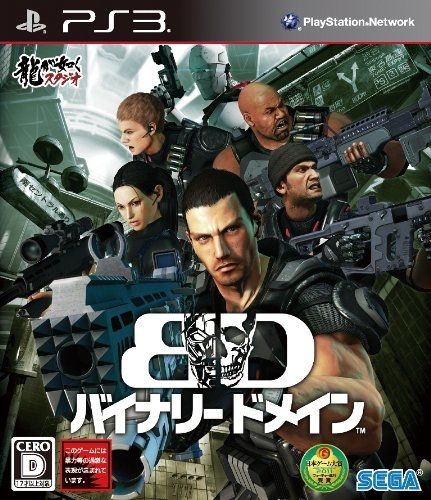
Everyone knows that I wasn’t too happy with the US/Europe box art for Binary Domain. But now we get to see the Japanese box art, which might not be amazing, but is better than the US/European artwork by a lot. Not only that, this one has the new ‘Team Yakuza’ logo on the box. Nice. That should move a few copies.


SEGA Japan is doing everything right with the game…Nagoshi is putting a lot of videos with him talking about the game, doing a lot of marketing…Kiryu as a present, good box-art. Please Japan, give a chance for this game.
This is probably my most anticipated game of the year. Just looks like a lot of effort and creativity went into the game. I can tell its gonna be a classic it has that SEGA charm to it.
I can’t believe it’s only about a month until this comes out. And with Yakuza: Dead Souls just a month later. I’ve barely had time to scratch the surface of Yakuza 4.
I think ours is better, to be honest. (Not that it’s saying a whole lot.) This looks like a bad movie poster. I love how every character’s looking in a different direction.
If any Japanese fan scans a high res version of the 360 box, I’ll gladly print it and cover up the fugly US cover.
I really hope they fix the West box art before it gets released
At least the one guy isn’t shooting at his team mates in this cover, but now a robot is their on their side?
Yes, his name is Cain, a French combat robot who is one of the five team mates you pick from.
http://segabits.com/wp-content/uploads/2011/08/hU5y7Frrd6L4cOqWYzdPWNh8jgPeMD51.jpg
Look at that style! That sophistication! That savviness! He should have been the main character! Game would have sold a million more copies!
^I’m gonna have to agree you on that!
I think it shows just how inadequate Sega West is as advertising there own games when a game made to appeal to a world wide and let’s face it, mostly western audience is being promoted a hundred times better in Japan… Like usual.