Way back in 1991, when Sonic the Hedgehog burst onto the scene in his debut game, the title made such an impact in the west that TV networks and animation studios scrambled to create an animated series starring the blue blur. With Sonic came his cast of video game co-stars however at the time Sonic’s stable of characters was quite small. Outside of the little animal friends and badniks, we had Sonic, Eggman (localized as Doctor Robotnik) and eventually, in 1992, Tails. The first animated series to get the green light was what fans affectionately call “Sonic SatAM” or just “SatAM” as the series aired weekly on ABC Saturday mornings. This series retained Sonic, Tails and Robotnik, but also expanded the cast to include the Freedom Fighters as well as a lackey for Robotnik named Snively.
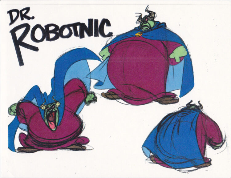
During those early days of development, which fans peg as around early 1992, it was clear that the production crew were open to anything and everything when it came to envisioning the video game characters in animation. No character saw more alternate takes than the villainous Doctor Robotnik. Over the years, concept art for some wild takes on the character made their way to the public. Many of these pieces are preserved through fan forums and wiki articles, but there is always a chance that more materials could see the light of day even 30 years later.
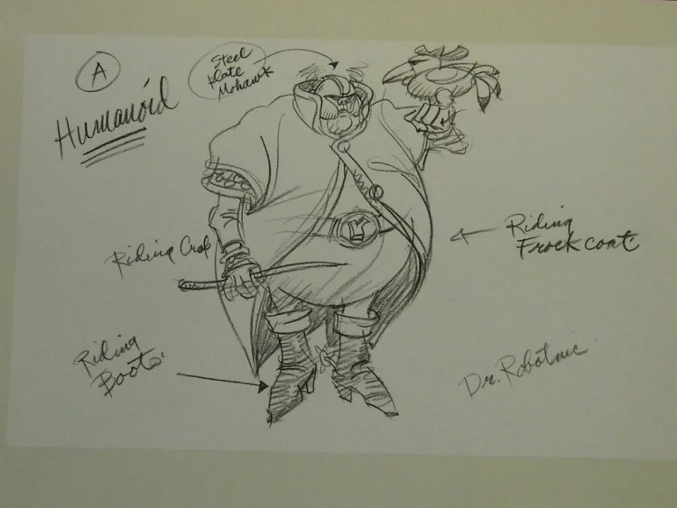
The art seen above was created by a freelance concept artist, no doubt given the direction to not feel tied down by the video game sprites and to go wild with the concept of a robot loving Doctor. Interestingly, this art has been around for a while and is labeled “A Humanoid”. Is there a version B? Actually there is, and it made its way onto the internet last week by way of the animation art website Animation Legends.
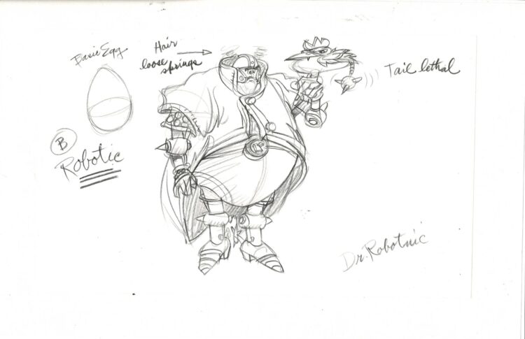
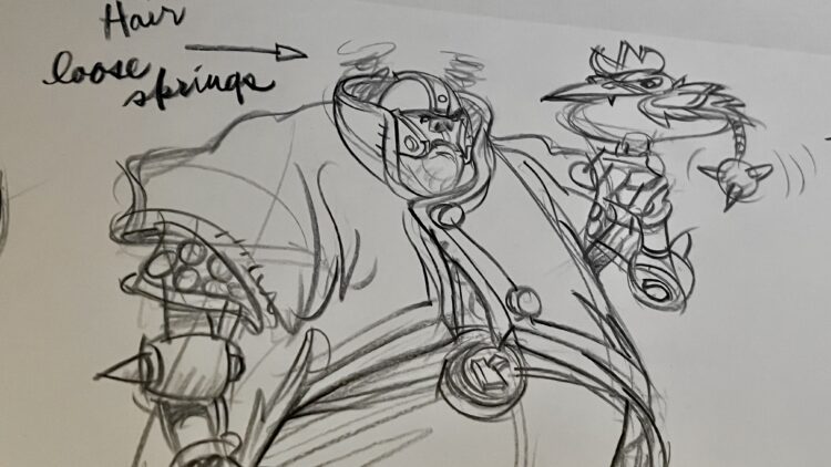
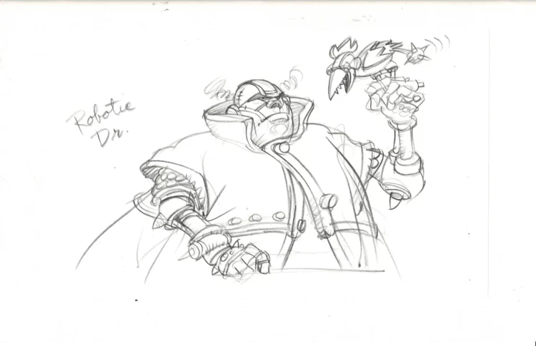
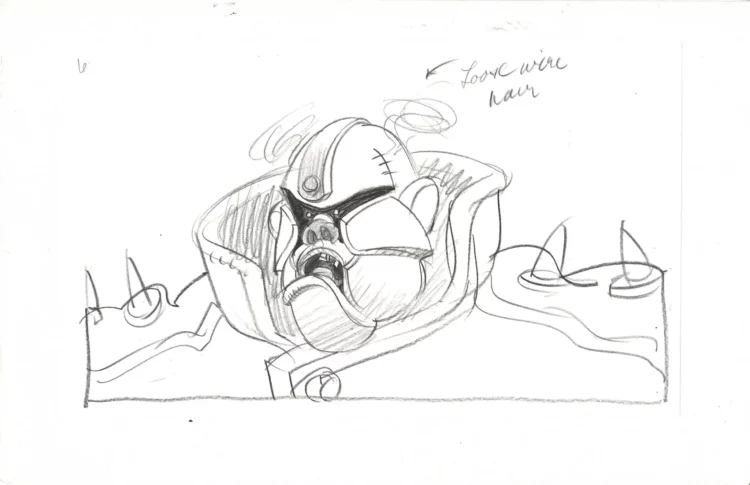
Two pieces of art appeared for sale, including what I consider the star of the set, the one labeled “B Robotic”. The art showcases a fully robotic Robotnik with a steel plate mohawk and what can only be described as frizzy hair made of loose wires. The concept art is clearly the B take of the A concept, which showcased a humanoid Robotnik. Either the concept artist was suggesting a before and after roboticization of the character or was considering how far to take the android nature of the SatAM take on the character. It is truly a wild take on the character, and a piece of art that I am excited to add to my collection of Sonic animation art! That’s right, the above piece now sits in the SEGAbits archives alongside a painting of Robotnik from Adventures of Sonic the Hedgehog artist Milton Knight, the first illustrated appearance of Knuckles without gloves and the script for the Sonic Underground episode where the Floating Island its’ protector Knuckles made his animated debut.
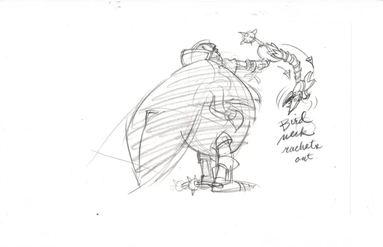
The second piece, seen above, shows off the back third of the character and a telescoping neck for his robotic chicken, which did make its way into the series with his pet Cluck. The last two pieces, seen below, appeared on the site this week. However, the prices were doubled. No doubt Animation Legends realized what they had on their hands and inflated the prices. These two pieces showcase a close up of the character design from the chest up and a close up of the face. The closer you get, the uglier he gets! Of course, the final design for SatAM Robotnik didn’t match this concept art, but there are kernels of ideas there including his robotic limb, robot chicken (hey, that would be a good name for a TV show) and regal uniform.
What are your thoughts on this wild take on the character? Sound off in the comments below!



Those early designs look really dumb and ugly. I mean, even more than what we got, and that’s saying a lot.
What were they thinking?
Maybe Ganon from the Zelda cartoon inspired it?
I think the earliest ones are more like Don Bluth’s old style. They feel like something out of Dragon’s Lair or Space Ace. Good for an animated movie but it doesn’t fit Sonic at all. As for the more robotic ones, Eh, not bad, but still not Robotnik enough. I’m glad the SatAM one is close to the original Robotnik design while being more exaggerated and menacing.