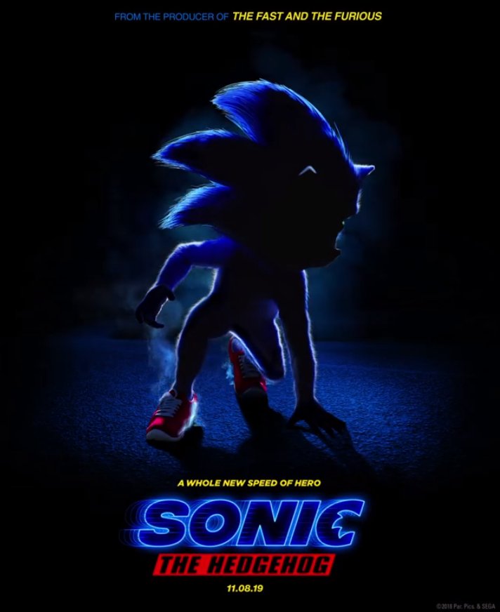
I think the reaction from a Japanese Sonic fan sums up my feelings on today’s “Sonic the Hedgehog” movie reveal: “Mr. SEGA, are you serious?”
Revealed as a motion poster by IGN, the video features a blue blur not unlike what we saw in the old Sonic 4 teasers. The blur eats through a path of rings which don’t quite make the correct sound we’ve known for the past 25+ years. Finally, the movie Sonic stops, hidden and shadow, and he looks… oh god. So, instead of opting for the tried and true design that has suited the character since 1998 (if we’re going by the modern design), Paramount opted for a bizarre hyper realistic design. Sonic is very hairy, has human proportions, weird little eyes and shoes that are in no way his signature sneakers. This looks bad. Very bad.
IGN’s has a lengthy interview with the filmmakers, and this bit jumped out at me:
The most challenging part of Sonic’s updated design isn’t revealed in this teaser: his eyes. The filmmakers struggled with how best to depict Sonic’s eyes because often he’s only seen with one, and that wouldn’t translate well to the live-action movie.
“I don’t think SEGA was entirely happy with the eye decision, but these sorts of things you go, ‘It’s going to look weird if we don’t do this.’ But everything is a discussion, and that’s kind of the goal, which is to only change what’s necessary and stay true to the rest of it,” said Miller. “He’s not going to feel like a Pixar character would because I don’t think that’s the right aesthetic to make it feel like part of our world.”
Really? Sonic’s eyes would not translate to live action? Have the seen the countless CG cutscenes? The many times a 3D Sonic has appeared in real world settings (Sonic Boom adverts, Progressive Auto Insurance adverts)? How does a real world setting change how you’d depict a 3D model of an iconic character like Sonic? He could easily appear in his traditional design and nobody would complain. I also like how they ignore SEGA’s feelings towards their design. Smart move, right? Ignore notes from SEGA on Sonic’s design.
Dear god, this movie…


Who is this for? Sonic has millions of existing fans, none of whom will be pleased by this. Is this designed for the general audience? If so, I can’t imagine most general movie goers will find this look appealing.
I ask again, who is this for?
Good question. I don’t think that anybody was asking for this movie in 2018.
Likely, it was the sort of deal that Sega thought could make them some cash and get free publicity, and for the filmmakers, an IP that was cheap to use, was familiar and still had a core audience.
Wasn’t this the same story for Namco when they approved the use of PacMan for Pixels?
haha. Haha. haha.
No excuse. Sonic isn’t a cheap IP, he deserves better.
Why couldn’t they have just made a full CGI movie?
It-it’s the Super Mario Bros. Movie (with Yoshi) all over again… Ahhhhhhhhhhhhhhhhhhhhhhh!
Pretty sure Sega is already regretting this. They’d be better of just cancelling it and finding someone else to make the movie.
But, you know Sega. They’ll release the thing anyway and “apologize” later.
The fastest way to login to Hotmail
ew
It’s going to take a while to get used to this Sonic representation, if SEGA end up accepting it.
I still think it looks better than the Pokemon movie coming up. But still, I think the Paramount people can do little better than this. Irregardless, I still plan on seeing the movie.
Segas should learn from the Detective Pikachu movie, now that trailer looked AWESOME! So, yes, Sonic could work as he actually is in our world, Sega shouldn’t need to change him. But this movie was doomed from the beginning and the situation only gets worse.
Who’s hyped for Sonic the Hedgehog: the Movie: the Game?
Yeah, THAT thing is gonna make so much more sense standing next to Jim Carrey.
It’s unbelievable that they’ve deliberated (and even argued) over these creative and design choices at all because they have made the worst decision available at every point so far.
I’m 28. I’m not in this film’s target demographic, but it’s incredible to me that Sega somehow takes it for granted that Ohshima’s Sonic was at one point literally more widely recognized than Mickey Mouse. I don’t know why seemingly everyone Sega employs or licenses thinks they can one-up that design, or why Sega keeps letting them try. It’s just frustrating to watch something so simple go so wrong.
The thing I don’t get is why they are still going with this design if Sega doesn’t like it. Did Paramount talk them around? Are the accepting it begrudgingly? Surley Sega would have wanted to have some control – if not final say – over how Sonic will look in the film? If so, why is this what we are getting?
The only thing I can think of is that Sega sees movie Sonic as separate to Game Sonic, similar to how Boom and main series Sonics are separate.
Even if Sega wants to keep gaming side separate from the movie side, both are Sonic and the audience would make the link
Like I said before I do agree that this whole thing looks bad, but we don’t even know the plot yet. And that Sonic for all we know is just a poster. Just a simple picture. Are we for real getting into all this fuss because of a simple picture.
Yes. Image is extremely important, especially in the digital age, and this is the kind of thing that will make an even bigger laughing stock out of the franchise. In a vacuum, sure, a film can have bad design but a great plot. There are wider ramifications though, in that the market at large will not care, and this is easier to ridicule than it is to give a fair chance. When info and opinions are spread through memes, this kind of design for something that was already a joke is a recipe for disaster.
How I felt about Daytona Championship USA. 😵
Valuable information. Lucky me I found your wweb site unintentionally, and I am surprised why this twist of fate did not happened
in advance! I bookmarked it.
Just want to say your article is as surprising. The clarity on your submit is simply cool and that
i can suppose you are an expert in this subject.
Well together with your permission let me to snatch your RSS
feed to stay updated with drawing close post. Thanks 1,000,000 and please continue the gratifying work.