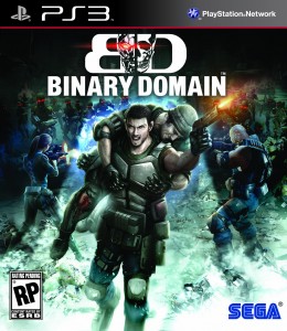
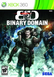
Don’t get me wrong, I love how Binary Domain is looking. But if I never heard of Binary Domain and was just going off of box art, I wouldn’t pick this game up. The box art looks way too cheesy.
This is the confirmed cover for both America and Europe. Hopefully SEGA sees their mistake and changes it. What do you guys think? I’m I being a negative Sally?
[Via: Gematsu]


I agree, it looks maybe a bit too japanese?
Binary Domain 1995!
Oh HELL naw! It looks awful!! Who’s bright idea was this?!!
It looks too flat and spatially makes no sense. Doesn’t represent a 3D game very well.
I think the problem is the guy jumping on the back of Dan. I mean, whats the point of this ? “Hey, we are in the middle of a battle, let me jump in your back just to show how much friends we are!”. And where are the robots ? This kick ass game deserves a better box art.
I think it looks different, and it will certainly catch peoples attention in stores.
Its not too bad, c’mon.
@Pao
It will get attention in stores with a box art like this. Just not the right kind of attention.
You know what? It’s kinda growing on me.
Seeing it blown up on my screen makes it better. The robots look menacing.
It’s definitely 90s boxcover art though.
It should just be a logo and a white or black background. I really don’t see the need for the poor looking mockup of an otherwise good looking game.
This further goes to kind of prove my point that Sega is going about marketing this game ENTIRELY incorrectly. Simply put, this looks wrong for the same reasons Conduit’s boxart looked wrong. Looks like a cheesy Genesis game from the mid-90s.
I don’t think people mentioned this, but who is he shooting at here? The robots? Nope, they are behind him. Is he killing his own people? What? Confusing.
Not only that, but the main character looks like he’s getting his nipples rubbed.
Just saying.
“It’s just a shitty box art! It’s still good! It’s still good!”
But hey, before you cast judgment you might want to see what Capcom is doing an already established franchise:
http://www.amazon.com/Resident-Evil-Operation-Raccoon-Playstation-3/dp/B004UDB9SA/ref=wl_it_dp_o_npd?ie=UTF8&coliid=I1DYOFWC90J3R0&colid=U5Q3LWW3G6F6
Charlie is twisting Dan’s nipples.
My biggest issue is not so much how confusing it is, but how they have barely any focus on the characters at all. Character interactions are arguably the biggest part of the game.
AND NO CAIN?!?
Boxart looks more interesting then the game itself….
This cover is really great! This looks like an italian exploitation movie poster from the 70s/80s. Videogame covers these days are boring most of the time…
^I really doubt that was the look they were going for, lol.
That Resident Evil Operation Racoon City whatever looks even worse,
and hey, SEGA! as great as you did with Yakuza 4’s cover, this
is not that cool but think its gonna work in the west this time better.
This is like those American old comic books.
What is this game supposed to be? I haven’t heard too much about gameplay, japanese mass effect or what?
Its a third person action shooter that has you going to Japan to take down an evil robotics company, along the way you will fight giant robot spiders, apes, humans and any other evil robots you can find.
It is also being made by the team behind other SEGA titles like Daytona, Yakuza, Monkey Ball and F-Zero.