Following the reveal of Sonic Boom, SEGA and Sonic fan communities exploded with discussion regarding the redesigns of the characters. Things like muscles, sports tape, scarves, tool belts, and blue arms became the subject of heated debates. Before the assurance from SEGA staff that the new game and TV show were a branch of the franchise and not a reboot, fans were both delighted and angered at the idea of Sonic undergoing another redesign after getting to know Modern Sonic for the past 7 years. Of course, fans of the franchise are not new to redesigns of SEGA’s mascot, so they can’t be blamed for assuming that Sonic was undergoing another permanent major change. While Sonic Boom Sonic and Modern Sonic “will continue to move forward in parallel” to each other, as stated by Sonic Team head Takashi Iizuka, the new Westernized design of Sonic is here to stay – at least for the near future.
As we move forward into the Sonic Boom era, we thought it would be fitting to look back at five major moments in Sonic’s history of redesigns, from buttface to green eyes and beyond. “Buttface” is enough incentive to read on, right?
Sonic Travels to the West
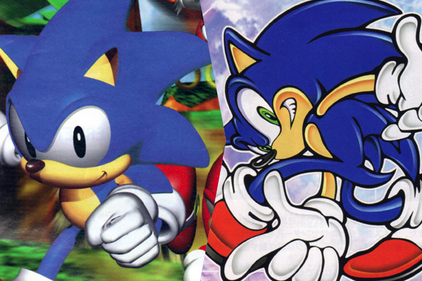
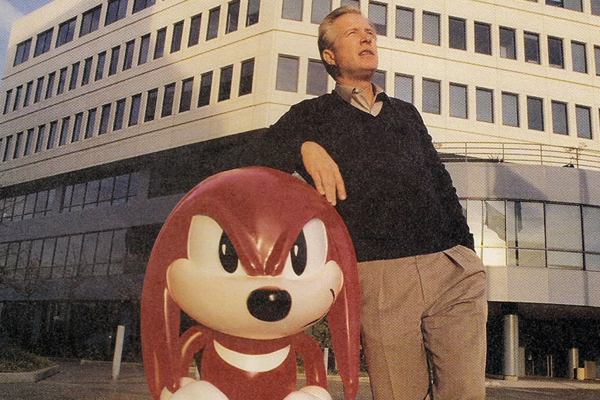
Sonic’s creation lends all of its credit to Alex Kidd’s failure to catch on as SEGA’s answer to Nintendo’s Mario. Knowing that Alex just didn’t have what it took to succeed, SEGA launched an internal competition to create their next central franchise character. The process took several months and saw designs that ranged from a rabbit, an American wolf, an armadillo, a Theodore Roosevelt looking man in pajamas, and a hedgehog. Of course, the hedgehog won out, and SEGA and the hedgehog’s designer Naoto Ohshima went to work on refining the design. The concept of more realistic spikes and fangs were dropped, and a near complete design was presented to SEGA of America. SEGA of America were not fans of Sonic’s design, which lead to the creation of Westernized art for use on the game’s box and all forms of advertising.
“I’ll admit that SEGA of America’s changes worked, but I have to wonder if they were all that necessary.”
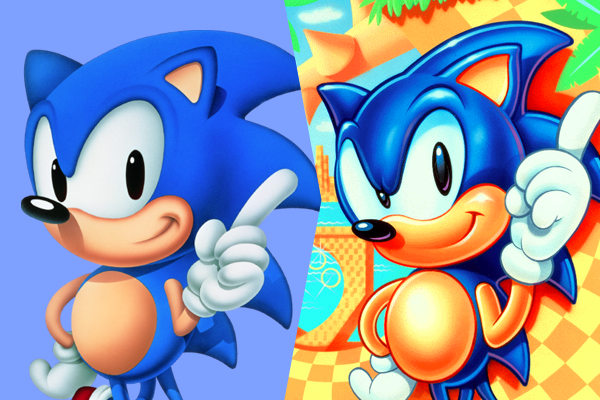
Sonic was given what fans refer to as a “buttface”, a pronounced brow that resembles a tiny blue butt. SEGA of America’s art also upped the attitude, making what was once an innocent smile a sly grin. SEGA of America Product Manager Madeline Schroeder recounted the process, stating that SEGA of America’s changes were made “so that he could actually work in terms of advertising, merchandising, the comic book series, and on television”. SEGA of Japan hated the changes, but the changes stuck, at least when it came to advertisements, packaging, and merchandising. As an American Sonic fan who grew up in the early 90’s, I’ll admit that SEGA of America’s changes worked, but I have to wonder if they were all that necessary.
Sonic’s First Adventure
Between 1991 and 1997 Sonic’s changes were minimal. SEGA of America stuck to their edgy angry Sonic and SEGA of Japan tweaked the character’s proportions, resulting in a smaller head and moved more towards an anime-inspired feel. Even when comparing 1991’s design with 1992’s design you can see this shift. Sonic’s buckles, which were present since the character’s early designs and seen constantly in Japanese art, were largely absent from American art and were usually unseen in the games. However, 1996 saw a rise of the buckles in games like Sonic the Fighters and Sonic’s Schoolhouse.
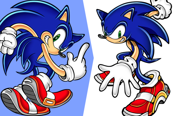
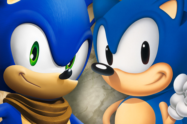
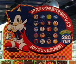 Hints of what changes were to come appeared in Japan, as new Sonic art appeared which acted as a bridge between Sonic’s classic look and the yet to be revealed changes SEGA had planned for the character. In 1998 one of Sonic’s biggest and longest lasting redesigns came with the release of Sonic Adventure on the SEGA Dreamcast. Yuji Uekawa, who had previously worked on Ristar and Flickes’ Island, was tasked to redraw Sonic and his friends and enemies. Uekawa did not take the job lightly, as he recounted, “Our mission was to renew the character, so we had to ask ourselves ‘to what extent do we change Sonic? What are the reasons for changing the way it looks?’ That’s what I paid close attention to.” The end result was a lankier, older looking Sonic with green eyes and the return of the buckle which was largely new to most American fans.
Sonic’s Shoes Blues
Being a direct sequel to Sonic Adventure, Sonic Adventure 2 did little to alter Sonic’s new look. However a major change to Sonic’s only piece of clothing, his footwear, resulted in what could be one of the biggest shakeups to the character’s design at the time as well as the most blatant attempt at product placement ever seen in a Sonic game. Real world company Soap Shoes, the creator of shoes which allow users to grind on objects via a plastic concavity built into the sole, inked a deal with SEGA which put the iconic mascot into a custom version of Soap’s Scorcher/Nitro shoes.
“…the game’s grinding mechanics, which existed well before the Soap deal, made Soap the perfect candidate.”
As a fan eager to play the game in 2001, I distinctly recall being well aware that this was a change made late in the game’s development, as Sonic sported his regular shoes in the Sonic Adventure 2 demo disc bundled with Phantasy Star Online and just six months later he was wearing his new Soap shoes. Was the decision a bad one for SEGA? Not at all, in fact the game’s grinding mechanics, which existed well before the Soap deal, made Soap the perfect candidate. I’m sure SEGA made a bit of money off of Soap, and Soap sold more shoes than they would have without the deal. Still, the partnership only lasted for one game and while grinding remains a series staple, Sonic returned to his iconic shoes in the following game.
Oh-No! ’06!
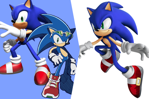
Following the death of the Dreamcast, 2002 through to 2005 was a murky period for both SEGA and Sonic. I’ll admit, as a die-hard fan of the series my interest waned with Sonic Heroes, Shadow the Hedgehog, and Sonic Riders – the latter two I didn’t get around to playing until 2010. The series had grown stale, and SEGA knew this. While early 2006 saw major design changes to Sonic and his friends via the Sonic Riders series, placing the characters in a futuristic world of hoverboards and giving Sonic a more anime-inspired design as well as new shoes and accessories, the main series of games didn’t see major changes to Sonic until late 2006 with the release of Sonic the Hedgehog.
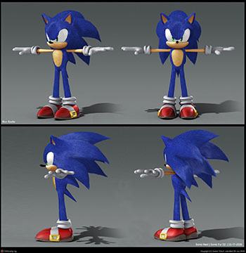 Not only would Sonic see a redesign, but the entire Sonic universe was to see a reboot by way of more realistic designs, deeper story lines, and darker themes. Sonic was made a bit lankier than his current design, and Sonic Team played with the idea of giving Sonic realistic fur. The fur concept was dropped, but Sonic did have more realistic textures and an all around darker color scheme and angrier look to him. Sonic ’06 ended up being a radical train wreck and the idea of a franchise reboot was dropped, but it’s interesting (and in my opinion scary) to think what would have happened with the reboot concept had the game been good. Who knows, maybe by this point we’d be playing a very different Sonic the Hedgehog 4.
Here Comes the Boom
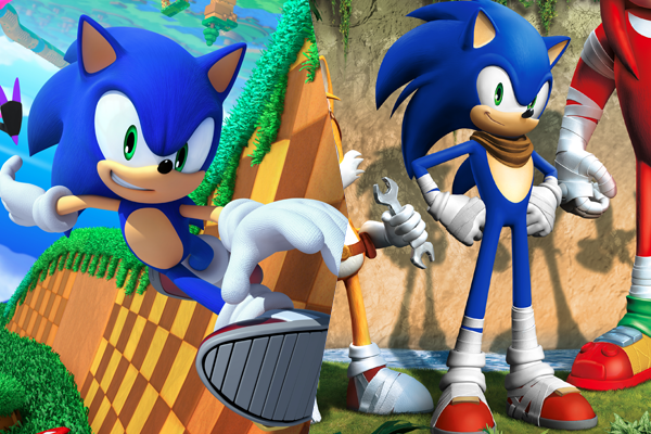
With 2006’s designs dead and buried, SEGA returned to the visual style last seen in 2003 and worked on bringing Sonic back to his brighter, cheerier days. While no main series games released in 2007, we did see the direction SEGA was taking Sonic’s design with Sonic and the Secret Rings. 2008’s Sonic Unleashed was the grand introduction of what we now know as Modern Sonic. While Sonic and friends all retained their Sonic Adventure designs, there was a lack of “edginess” and “realism” to the updates. Sonic’s proportions seemed to be on the mark, the character was neither too childish nor too angry. SEGA finally hit their desired target, finding a timeless look for their mascot that has gone largely unchanged to the present day.
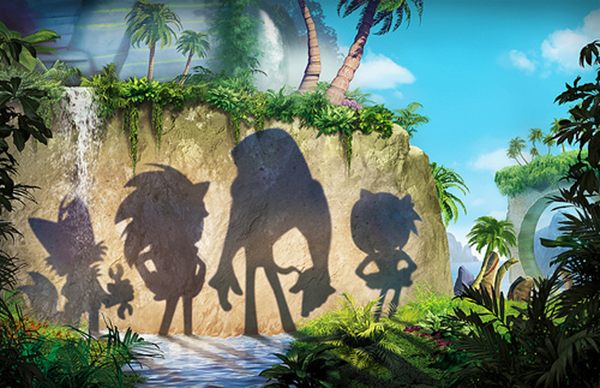
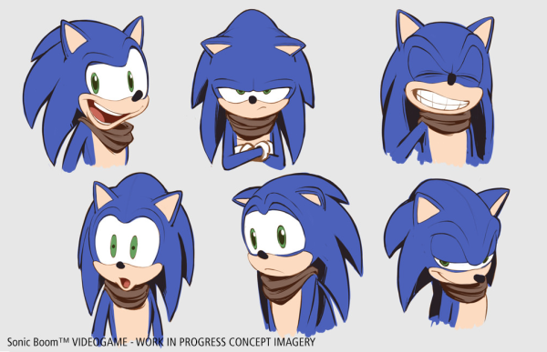
Enter Sonic Boom. Late last year SEGA confirmed the rumor that a CG television series was in the works with the title “Sonic Boom”. Nothing more than the channel, episode count, a brief plot description were announced at the time, but since then we’ve learned a lot including that Sonic Boom will feature redesigns of Sonic and the secondary cast members, as well as the reveal of a Sonic Boom game developed by Los Angeles, California developer Big Red Button Entertainment. Several changes are immediately apparent in Sonic’s design, he appears lankier with blue arms and a few more spines, and has the addition of athletic tape and brown scarf. Sonic’s shoes have also been altered, with the gold buckle moved to the top and the tape acting as the white stripe. The reasoning for these changes was explained by Big Red Button head Bob Rafei (of Uncharted and Jak and Daxter fame):
“We were exploring different outfits and we went through a lot of iterations and the scarf was something I’ve used in the past and it works for me and it works for the character. Really, the history of that comes from the old western days, with John Wayne, and as a kid watching a lot of those westerns, that really stuck with me. And you see the use of the afghan in a lot of action movies because of the soldiers and what’s happened with more association with the Middle East. So that DNA made its way into what makes a character action hero nowadays. I was part of the team that created Uncharted, so it’s hard to take the DNA out of that.”
As for the athletic tape, it has been described in numerous interviews as an expression of the character’s love of action and movement. It only makes sense that a character like Sonic who loves running and jumping would use something like athletic tape. In our interview with SEGA of America producer Stephen Frost, we brought up the redesigns and this was his reply:
“We knew right away that we wanted to provide something new yet familiar. The sort of directions that we went in redesigning them was to obviously put a fresh coat of paint on them, and also to help appeal to a larger audience as well hopefully. If you look to super hero teams, the important aspect to it is the diversity to the silhouettes and Sonic Team in general in the past have maintained a consistent size and height ratio. Part of that is due to the origins of where Sonic was created in the 16-bit days where they had to work with certain hardware limitations. We wanted to be able to have a situation where if you were not familiar with Sonic and his friends, you knew who they were and what they did just by looking at them. That’s a key thing.
So along those lines, we wanted to make sure these changes were not overtly extreme for no reason because we knew that when these guys were unveiled that the Sonic fan base was going to be very split on it. There were going to be a lot of passionate people who didn’t understand what we were doing and there were other ones who did and accepted it. But I was happy that while there are still questions about it and uncertainty, that given the few days or week after the event and people had more time to spend with the designs, I think that for the most part they’ve come to understand why we did it and are okay with it.”
Sonic still goes on evolving
As evidenced, the past 23 years have seen many notable changes for Sonic the Hedgehog. Some for the better, some for the worst, and others that fans still debate to this day. Despite being a spin-off series, Sonic Boom is potentially the biggest thing to happen to the franchise in a long while and very well could shape the franchise moving forward. Could we expect to see changes on the SEGA of Japan side of things if Sonic Boom proves to be a hit? Only time will tell. As the end of the 10th anniversary history book says: “Sonic still goes on evolving.”




I just have a question about the tape. I don’t hate it, I just don’t get why it is over the shoes?
It’s how sports tape is used. http://www.gannett-cdn.com/-mm-/ed84b31b060d0a079f33a0d9fc776bbb9efd4067/c=156-0-4725-3431&r=x404&c=534×401/local/-/media/USATODAY/test/2013/10/31/1383267331000-cxx-spat-a-reg-01.jpg
ooohhh.
One of the most alarming things about the SB redesign is how much it has in common to the 06 proportions than any other design. I fear that what was once an iconic character is now in the same generic animal adventure territory as ratchet and clank, sly, and plenty more late 90s early 2000’s 3d platforming rejects. Even the official artwork feels a little amateur-hour-y.
Still, here’s hoping for the best.
Sly and Ratchet are not generic. WTF
At least for SB design the buttface has been removed for the most part. What a symmetrical nightmare it is. : D
One thing I don’t get, in the Sonic Boom concept pic, why do Sonic’s spikes look so smooth “like the should be” rather than what we saw in the trailer?
I like the Sonic Battle designs a lot. They’ve got that sketchy look that Mario Strikers also used; I dig it.
While I do like the refined design of the more recent “Modern”-era Sonic, I’m not so sure I agree with it being “timeless” – I think that honor belongs to the original Ohshima design. It’s a simpler, no-frills design that screams ‘pop culture.’
I’ve never heard the term “buttface” used for the western Sonic art of the earlier 90’s, but it gave me a giggle. Sure, it’s dated and indicative of the era it was intended to pander to, but as the version of Sonic I was most familiar with as a child, it’ll always hold a special place in my mind, posterior brow or no.
you have mad sonic suck i going to be a mario lover you bock my cillhd sega . love sonic 1 fan
How boring is talking about sonic everyday. SEGA don´t have more things interresting to do? Is just Sonic all the time?
I like the sonic lost world design who make the sonic and knuckles steroids design in sonic boom should be fired sega replace the designs make the best sonic game with graphics storie and all the sonic friends and enemies and the platforms game PS3, PS4, XBOX 360,XBOX ONE, PC