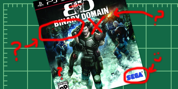
Since the reveal of Binary Domain’s box art, I’ve been thinking about just what is it that makes it so… ineffective. I hesitate to use the word “bad”, as artistry clearly went into producing the cover. However, I think the reason for the cover’s failing is that not a lot of thought went into it. Sure they threw a lot into the scene, but perhaps they threw in too much? I’ve been working in the graphic design industry for five years now, so I thought I’d put some of my professional experience to practice and pick apart Binary Domain’s cover art problems, and perhaps find a better solution. Is it worth the time picking apart the game’s cover? Of course it is! As a new IP, the only thing the game has going for it is SEGA’s name when it comes to appearing on a shelf. First impressions are key for a new franchise, and sadly Binary Domain is not making a good first impression.
It’s too busy!
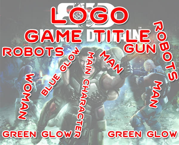
I’ll admit, I have not watched a lot of the Binary Domain story trailers, mainly because I want to be surprised, so I came into looking at this cover with virgin eyes. What did the cover art convey about the game? A whole shit load of stuff! People fighting what appear to be robots, an odd blue glow behind the main character and a dude he’s carrying on his back. I see a man and women, this strange green glow on the ground. All these elements and none of them really fit together. Is the main character running away? Is he using the dude on his back as a human shield? I could assume this, as the blue glow might be a plasma shot from one of the robots, hitting the injured dude in the back. Who is the main character shooting at? The robots are behind him. It’s just a jumbled mess.
Less is more
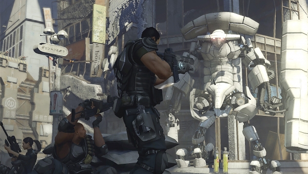
One comment on the original news post of Binary Domain’s box art suggested simply having the logo represent the game. Sorry, but that just doesn’t work unless it’s an established franchise. Sonic, Mario or Halo plus a subtitle or number would work. The name alone is a character and represents every aspect of the game. But simply “Binary Domain” and the logo would be both lazy and overly presumptive on SEGA’s part. SEGA needs to assume that nobody knows that Binary Domain is (as many people don’t know what it is), and they need to convey what it is on the box. Unfortunately, the final art includes too much. The game has squad based combat with humans versus machines, and the final art does convey that, but not well. The squad is all on the cover, but they’re disconnected and don’t seem to be communicating with each other. The robots are there, but are hidden in the black and blue background and are nearly invisible when viewing the box from a distance. A better representation of this idea exists in the screen shot above. It has the three main squad members working together and shows off a massive robot in broad daylight (a rarity for games to show off daylight combat). The image above excites me far more than the final cover art.
It’s so freakin’ bland!
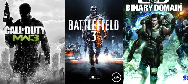
I just know SEGA was thinking about the above comparison and figured it would work in their favor. Check it out, hero with a big gun walking towards the camera, lots or green, black and blue colors, blurry out of focus undefined background. Of course, with Battlefield and Modern Warfare, the real selling point is the franchise. So they can get away with this bland idea. However, Binary Domain is not well known, so not only does it feature bland art, but it touts a new unknown and frankly confusing title. I love the name Binary Domain, but it doesn’t really incite the excitement of guns and battle like, say, “Battlefield” or “Bulletstorm” does. Unless you pair the title with effective art, it doesn’t work.
Conclusion
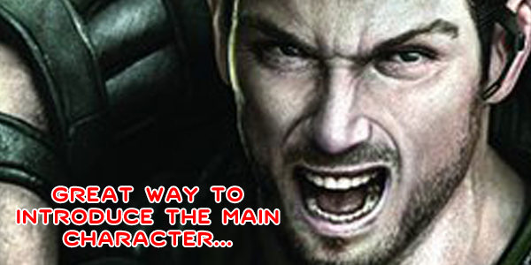
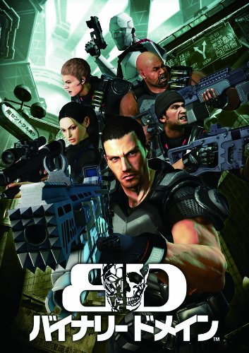
So when it comes down to it, Binary Domain’s cover art does not work because: it is too busy, it is not cohesive and it is cliche. Also, the main character looks incredibly awkward carrying a man on his back while making a goofy “RAWR!” face. Definitely not a good first impression. You just know the Beavis and Butt-head’s of the gaming world are going to say “huh huh, whats that one dude doing to that other dude’s backside?”. It will be very interesting to see how Japan presents the game. I hope we’ll be seeing a very different cover when the game releases abroad. Thus far, all I could find was this promotional image on Amazon Japan’s product page. It may be a different kind of cliche (reminds me of Time Crisis or Outtrigger), but it is an improvement over the Western art:


I have to say I’d take the Western art over that ^ image there at the end, but yes, both are indeed bad.
Very nice article. My problem with both pieces of art is that they look like something that would be slapped on a Genesis cartridge rather than a modern video game’s boxart. Binary Domain is, last I checked, supposed to be a modern game, and one that takes itself seriously too, so I don’t think either image makes the game look modern or, frankly, makes the game look like it’s any good.
http://i.imgur.com/EyvzK.jpg
Maybe they were going for a kind of “old school” look, like what game covers back in the day were like, or perhaps Blade Runner?
When I think of great covers for games I think of ones like Ico, Resident Evil 4 (PAL), and Katamari Damacy – art that practices subtlety, something BD clearly wasn’t going for. Although, I kind of like when covers shows how batshit crazy some people are out there.
Most intuitive feature I’ve ever read!
hahahahha
now to think of it, the box art is not well designed or presented.
There are enemies robots behind and the guy is firing in front.
One of his companion should at least fired in front to show an example that there are enemies in front.
second the stupid light, looks like alien abduction coming from the logo.
I can understand it’s meant to be like DooM boxart, but they didn’t nail it.
I’ve always hated the boxart. The main characters face looks like it might be one of the devs of the game, he is sort of geeky and dorky looking and they just stuck the face on a semi buff body.