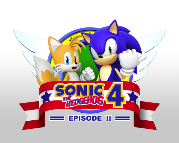
When the Nvidia CES press conference was nearing, SEGA of America’s community team was pointing Sonic fans towards the live stream, hinting that something would be shown. After watching an hour of the show, there was absolutely nothing Sonic related to be found. Fans, myself included, felt like they just wasted an hour. Thankfully, the SEGA community team was quick to apologize for the time spent, stating that “there was a last minute switch up during the press conference”, and uploaded the official Sonic 4 Episode 2 logo to the SEGA Blog! I gotta say, it looks exactly like what I expected! Even some fan creations came pretty close. Good on SoA for remedying the situation!
Ad:


I was not a fan of the first. This one doesnt look much better either. At least modern sonic loOks less like an asshole compared to eps 1’s. Sadly he still looks like one though.
Its funny how their stance is the same as sonic 2’s an that it doesnt even look nearly as good.
@Crazytails – Don’t you have anything good to say? -_- Seriously man, quit whining.
Would that make you feel better?
Sonic I think looks fine, Tails looks like a bad plastic action figure though, wtf?
Not that I particularly care, but eh. Weird.
What?! No he doesn’t! xD Now everytime I see this logo, you will remind me of Tails looking like an AF. Thanks……. -_-
It’s crazy how all they did is move sonic’s arms compared to episode 1’s. I know it’s just a logo, but someone’s gotta ask why they won’t bother putting at least a bit of effort into it.
[img]http://img825.imageshack.us/img825/8766/cheapreusede1pose.png[/img]
I’m surprised you have not pointed out all it is is a downgraded copy and paste job of Sonic the Hedgejog 2’s title screen. It is night and day in the difference of quality between those two (And Sonic the Hedgehog 2 wins out easily)
I hope this does not mean we get even more reskin Sonic the Hedgehog 2 stages, but after this, I’m not sure if the good will that has been built with Colours and Generations should be applied here.
Im not bothered by the logo, its exactly what I expected it to be. Of course modern renders wont beat out the classic logos, but Im happy they went with the Sonic 2 poses. Ken has stated that the stages will be original, so I dont think the Sonic 2 poses point to more rehashes.
Oh no, Logo isn’t perfect.
GAME RUINED!
Personally I don’t have a problem with it, like any logo of any Sonic game I don’t feel anything towards it…
i like the logo is cool i dont care about sonic i just care that tails is in this game
Modern Sonic looks so lazily changed from the previous model of the episode 1 logo. They only changed the positions of his hands.
Well, it is an episodic sequel, not a full-on sequel, so should this logo permanently replace the episode 1 logo when you boot up the game it would make sense to retain a bit of the first logo in the second one. Though, if episode 2 is completely separate from episode 1, not even liking the world maps, then they should have done a new render of Sonic.
who cares how it looks. sonic is sonic, tail sis tails. they don’t look like different characters from other franchises. What matters is the flippin gameplay.