The Sonic Stadium got their hands on nineteen new screens from the Wii U version of Sonic Lost World, and they’re quite revealing! Desert Ruin is seen in a few screens, showing off a new giant cactus enemy, as well as iconic loops, a sand tornado, and the drill and eagle Wisps in action. A wild jungle stage is seen, which has been previously revealed in the Color Power trailer, also seen is a night stage filled with robotic owls which are seemingly on the lookout for our hero. Sonic Gear Solid? [Update: ONM UK has revealed that this stage is named Silent Forest] Most exciting for classic Sonic fans is the reveal of a Casino Night inspired zone, a stage which was sadly not a full-on action stage in the console version of Sonic Generations.
After the break, check out a full gallery of all the images!

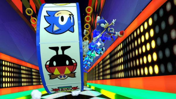









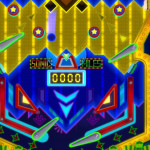
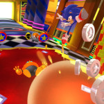







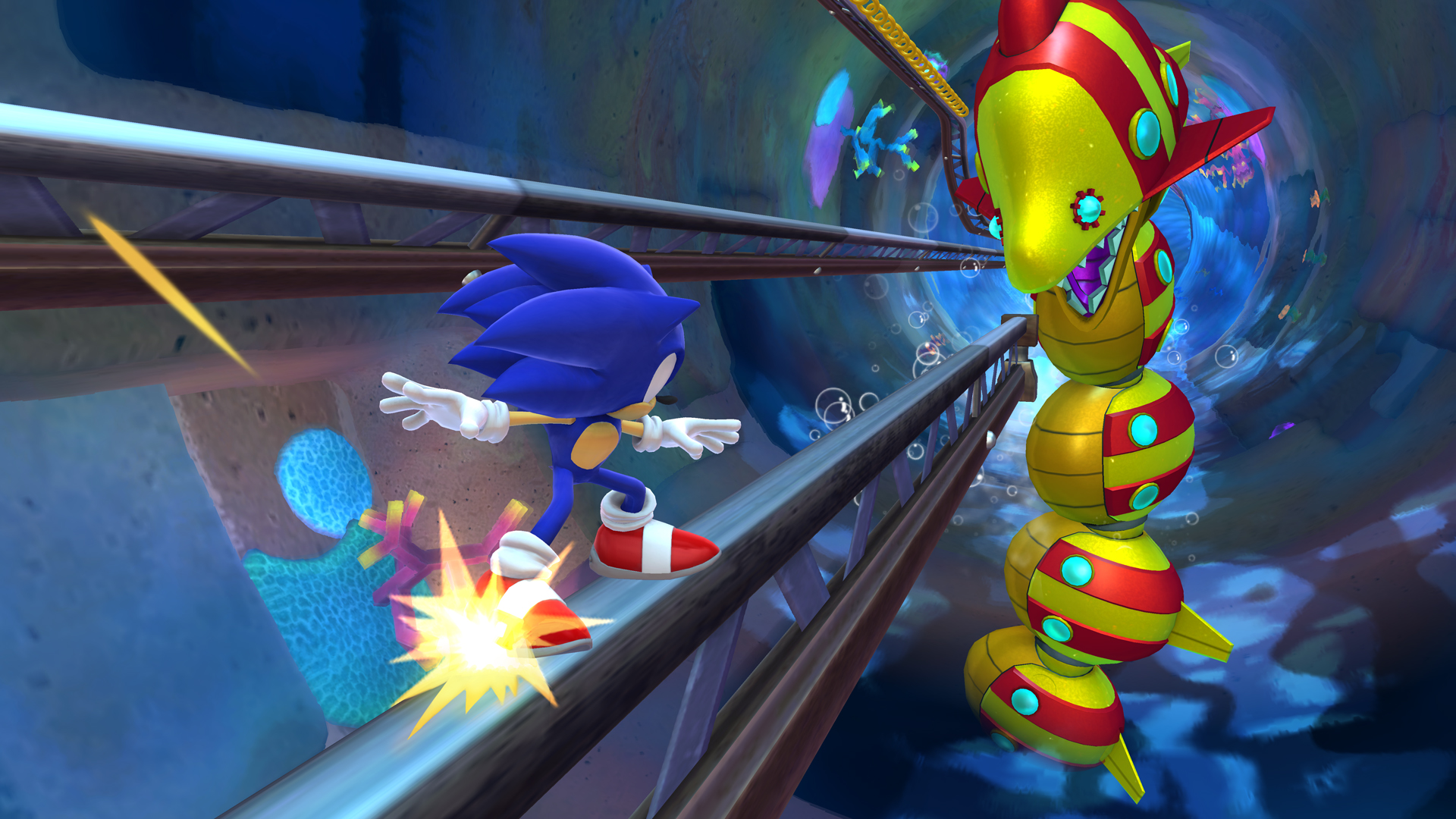

i can see the casino night part of the level. to me though the ground parts look alot like bingo highway from sonic heroes
I’m probably the only person who’s getting sick of this whole pandering to nostalgia-hungry fans.
The whole E3 video was some Sega representative dude being like “LE LITTLE REFERENCE FOR THE OLD FANS XXXXXDDDDDD” every 2 minutes. Now we get recycled stage ideas.
I don’t mind throwbacks, but IMHO they’re supposed to be subtle, not “HEY, HAVE ANOTHER REFERENCE!!!!” kind of deal if a game isn’t supposed to be fanservice start to finish like Generations was.
Even Sonic ’06 got that part right, Wave Ocean was basically Emerald Coast ver. 2, but it wasn’t 100% obvious until the (poorly executed) whale part etc.
I want an original Sonic game, a game with levels that feel completely unique, not just in layout. Sonic Adventure 1, 2, Rush, Heroes, Colors, Unleashed, even ’06 to an extent, these had cool, fresh level ideas that didn’t look or feel like anything featured in a Sonic game before. Now all we get is recycled shit.
^Why not both? As the game has been doing so far
I guess I’m the only one sick of casino levels in general. Ever since the very first one. I hate mechanics of them, the lack of diversity (even the tracks in the first All-Stars racing), and a lot of it has to do with the fact that they use the same color scheme of overly using red, yellow and black. I’d be okay with never playing another casino level in a Sonic game ever again.