
June 7th, 1990, SEGA showed off Sonic the Hedgehog to the public at the Tokyo Game Show. When they showed it, the game was 2 months into development. So what they showed was very early.
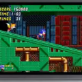
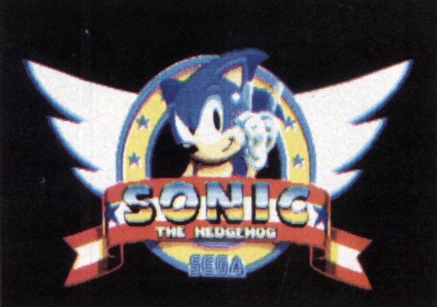
Above is one of the first screens ever shown to the public and you can tell much has changed. First of all the background, from its odd city and mountains was changed in the final product. Though, regardless of stuff being changed, the art style and vision seemed to be there from day one. The other screen that 1up had was the early title screen, which looks a lot like the original only without the Green Hill Zone backdrop.
[Source: 1up]


i think i like that sonic character model MORE then the current Sonic 1 model. He looks cool there.
mysterious
Looks so much better than Sonic 1, before they added all those gimmicks like rings, enemies, score and a life counter.
Agreed on the Model looking cool. I like the cowboy pose.
Two months in development with no previous design direction at all and looks better than Sonic the Hedgehog 4 in every way =/
The art is not as good as the finished product though, it looks too generic cartoon style, like you see in something like SEGA's Taz games for instance. Though I like that too.
Very interesting find, thanks!
Also to respond to Barry on the 'gimmicks', a gimmick is a design choice that is unique and supposed to help make something stand out from the crowd, everything you mentioned (rings fall into 'items you collect' category) was done in earlier platformers. Stuff that made Sonic stand out were the simplified (read: better) momentum building and some stuff like the bonus stages and generally crashing into your enemies while rolling.
And yes, the cowboy pose is epic.
Wasn't the orignal version of Sonic right before the release date suppose to be a lighter shade of blue, which was changed to a darker shade to facilitate discrimination between the background (blue ocean) and the character (Sonic).
I am in favor of all the changes that Madeline Shouder make to Sonic The Hedgehog and with Sonic Colors it seems like the Japanese are finally starting to understand that as the plot is very similar to the American Version of Sonic The Hedgehog 1.
I love Sonic games and especially the MD Sonic titles. But this!!! So mysterious, so obscure. Too bad they didn't keep that artwork! Is has way much better atmosphere than the happy and cute Sonic 1 finished game. The mountains remind me of one of my best MD games, Shadow of the Beast!
Uranus, I have a feeling Barry was being sarcastic.
Walking and running was such an overhyped gimmick. They should have stuck with just rolling. And the soundtrack should have been done by Chamillionaire.