Welcome to a new SEGAbits feature: SEGA by Design. Believe it or not, SEGAbits is not my day job. When I’m not working on the site, I’m a full time graphic designer. Before I decided to make graphic design my profession, I grew up wanting to be either an animator or a cartoonist. My childhood influences included 90’s cartoons and video game cover art, and while I loved such works as the covers of the classic Sonic the Hedgehog games, I found myself even more attracted to the package designs that encapsulated the artwork. At the time, I had no idea what this sort of thing was called, I just knew that it was slick, uniform, and involved colors, shapes, and fonts. It wasn’t until the Playstation game Wipeout that I learned of what graphic design actually entailed through the work of The Designer’s Republic. From there on out, I knew I wanted to be a graphic designer and four years of college and seven years of professional experience later, here I am about to tear into the cover art of one of my most favorite SEGA Dreamcast games: Capcom’s Power Stone 2.

Before we get into Power Stone 2‘s crimes against design, I wanted to look back at the original Power Stone cover art. Above you can see the North American (left) and Japanese (middle) cover art for the original game. The North American cover features the early white design that was applied to Dreamcast games released before mid-September 2000 (September and October 2000 saw the transition to the black cover design). Both the white American cover design and the Japanese orange stamp in the upper right hand corner take up minimal space, allowing for the game’s artwork to breathe. Interestingly, while PAL Dreamcast art (right) usually has Dreamcast branding taking up 1/6th of the cover art’s space, Power Stone was lucky enough to be one of the few titles not encumbered by the big blue bar.
While the Japanese cover art is the clear winner, what I liked about the American cover art for Power Stone was that while it does crop a good deal of the Japanese art out and removes the biplane, it retains the feel of the Japanese cover art – albeit with less characters on show (something that the PAL art did well, despite resembling an art assets sticker book).
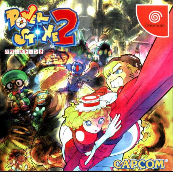
Power Stone 2‘s cover art is just awesome. Capcom’s art team created some amazing works, as collected in the excellent Capcom Design Works art book, and the Power Stone sequel stands out as one of Capcom’s best. The eclectic layout and watercolor style coloring evokes a sense of adventure and chaos, both appropriate terms for the setting and tone of the game. Fans of the original game receive hints of the new characters and their super forms on the cover, which just makes you want to pick the game up and see what new surprises await. All-in-all a solid cover for an excellent game.
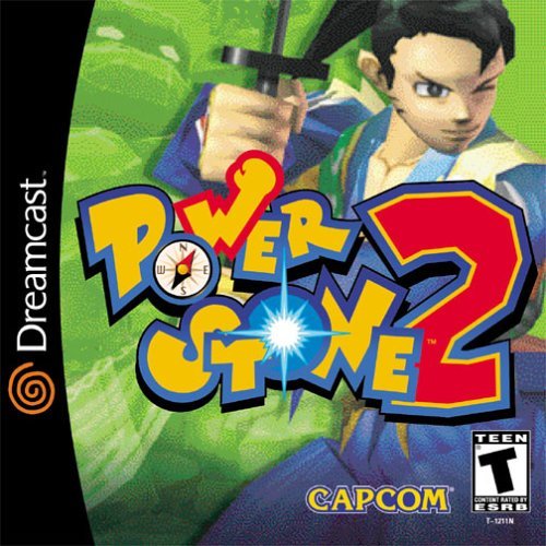
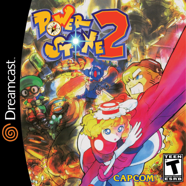
And then we have the North American cover art.
What. The. Fuck.
That’s what ran though my head when the game released in 2000 and it is what runs through my head today. What was Capcom’s design team thinking!? Does the creator of this garbage even deserve the title of designer? Let’s break down what we’re looking at. Gone is the lovely original art, and in its place is an in-game model of the character Ryoma. Ryoma appeared in both games, and was a rather prominent character in the anime, but in the grand scheme of the franchise he is not a main character. Falcon or Rouge would be a better choice for a character to feature on the cover, but even then that doesn’t make selecting one character’s in-game model as the focus of the cover art a good idea. And why an in-game model? Outside of victory poses, Power Stone 2 rarely zoomed into the characters that closely. The character models were made to be seen from afar, amongst the chaos of four player battles. Putting the in-game model in such a prominent position only amplifies the flaws of seeing Ryoma so closely.
A game like Power Stone 2, which features four player gameplay and a selection of 14 characters, shouldn’t focus on a single character. The aim of the cover art should be to show just how varied the cast of characters are, something that the Japanese and European covers do well.
But wait, look at the toxic green background and you can see Capcom’s half-assed attempt at featuring more of the cast. We can see some sort of rock monster and a man in a mask. These would be Gunrock and Accel in their super forms, but a person new to the game would probably not even take notice of the two additional characters. I’m sure there are a few more characters hidden behind the blocky Ryoma, but I can hardly make out the initial two as is. The one positive that I can think of is that the logo is big and eye catching, but the appeal of the logo goes out the window when placed on such an ugly layout.
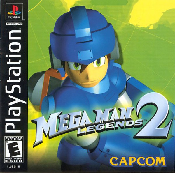
Capcom’s design team were at it again three months later with the release of Mega Man Legends 2 for the Sony Playstation. It seems the designer, on crunch for time, turned to the old Power Stone 2 design file and replaced the assets with Mega Man materials. I’m not just being snarky, I honestly think that is what they did. The background is the same puke green color, the character (this time a pre-rendered model that still looks like crap) has the same drop shadow, and there is a black gradient coming up from below. The one addition is a green glow around the logo, something the Power Stone 2 logo didn’t need thanks to a drop shadow already implemented into the logo itself.
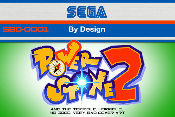
While Capcom is solely to blame for Power Stone 2‘s awful American cover art, I couldn’t help but have some fun by applying Capcom’s design sensibilities to a SEGA Dreamcast classic:
I apologize.
I have to wonder how Capcom’s American cover art impacted sales of the game. We’ve yet to see a Power Stone 3, and the most the franchise has seen since the Dreamcast release of the sequel was a PSP collection and cameos in various Capcom games. As a gift to American Dreamcast fans everywhere who had to put up with the bad Power Stone 2 cover art for the past 14 years, I present an alternate version which you can print out, trim, and slide over the ugly original. Enjoy!




ahahaha.
I’ve only played the demo for Power Stone, but I think your criticisms make sense. It’s just a couple of Power Stone renders put together and they don’t make sense. Like you said, Ryoma doesn’t transform into the form shown on the right. hell, you don’t know that what the Gunrock transformation is: is it enemy, friend, a member of a robot society? Did Capcom make an Onimusha spinoff? :S Confusing cover art. Plus Power Stone is most fun to watch when its chaotic, so drawing attention to more characters is good for conveying what its about. I’ve spent some time checking out Power Stone media over the years (even watched some of the dubbed Power Stone anime!) and I wish I played the games =P
Incidentally, on the Mega Man Legends note, the first game’s cover art also featured like this weird, no context use of orange and yellow with Mega Man Volnutt on front. The global sphere outlines that show up on MML2 don’t tell you too much about what the game is about, it would be a little more meaningful if the the defining features of islands were more pronounced (or just use color instead of all green!)
I didn’t even know Power Stone had an anime.
That Sonic Adventure 2 is surprisingly not atrocious. Perhaps if you used a supporting character like Knuckles, it would capture the spirit of PS2.
Huh, never even realized the similarities between the Power Stone 2 cover and the Mega Man Legends 2 cover. Mind blown. 😛
On the subject, there’s also this Tron Bonne spinoff cover:
http://en.wikipedia.org/wiki/The_Misadventures_of_Tron_Bonne#mediaviewer/File:Misadvbox.jpg
Thank Bartman for pointing out the Mega Man similarity, and wow, that Tron Bonne cover is the exact same sort of style. Definitely the same notorious designer.
What kind of graphic design job do you do? Branding? Print? Web? Layouts?
I work in print and web design, did magazine layouts and website design as internships. Have done DVD package design and CD case designs as freelance gigs. You can see my portfolio linked above, just click my name.
Barry I studied design as well ( would like to get work in it ).
It is the fault of the current trends; at that point in time. Green is kiddie/slime/Halloween and 3d was being pushed until Windows 7 and Tablet browsing came along.
Power Stones failed because the Dreamcast barely had any advertisement over Sony. Sony had cornered the market releasing both PSX and PS2 games at the same time. They also was giving free advertisement to games as well. Nintendo people had Pokemon and believed that “Jetforce Gemini” is an RPG.
I knew the animation and played Some Power Stone. The only reason the their is no three is because their was not enough players to even play that game. Look at “Rival Schools” even that game was ported the living daylights out of, and had an awesome sequel.
Personally the Japanese cover is the better cover no matter what. The American cover just put the lime-light on one character as if it was Ryu. A cheap crop as you said. The EU cover just have them all standing in line ( like in an play ).
Going back to the J cover. That is clearly water painted. A skill which many people are too stupid not to learn or take up. The Japanese cover probably looked like crap to the American team; and somebody got scared and said “lets just promote a 3d character on the cover”.