Sonic’s Road to Redemption: 2006, the Fall
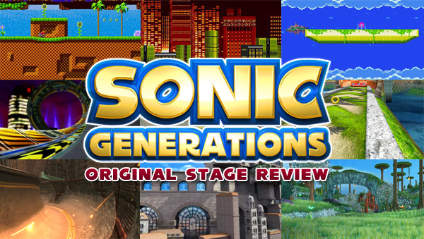
This six part series looks at the disaster that was Sonic’s 15th anniversary, and how the series slowly redeemed itself over the following five years, culminating Sonic’s next anniversary title, Sonic Generations.
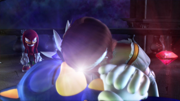
It’s a little hard to believe that it’s already been five years since Sonic the Hedgehog or “Sonic 06” as it’s called by fans, made its debut. It feels like only yesterday that this infamous train wreck of a game was released and utterly destroyed what little credibility the character had left in gaming. Of course, by 2006 bad Sonic games were nothing new for anybody. Even in his halcyon days Sonic still churned out stinkers, like the infamously not 3D Sonic 3D Blast, and the utterly horrible (and largely forgotten) Sonic Jam for the Game.com. Heck, the franchise had churned out a whopper of a stinker just a year before in the form of Shadow the Hedgehog, the first Sonic game from Sonic Team to average in the 4s on Game Rankings. Even so, Sonic 2006 represented something new for the franchise: it was the first main entry considered utterly deplorable by both critics and fans alike. Sure, Sonic has had his “controversial” games. Sonic Heroes sparked some massive debates on the SEGA forums back in the day and the Sonic Adventure series had its share of dissenters in the press that grew ever more vocal as they were re-released on other platforms. None of them have received the amount of vitriol and did the same amount of damage to the franchise that Sonic 2006 was able to do with its released.


")
